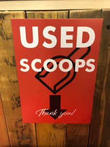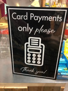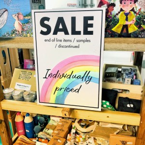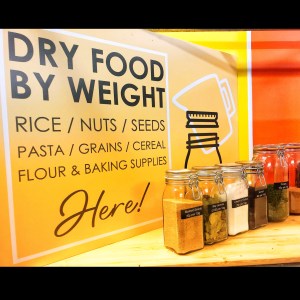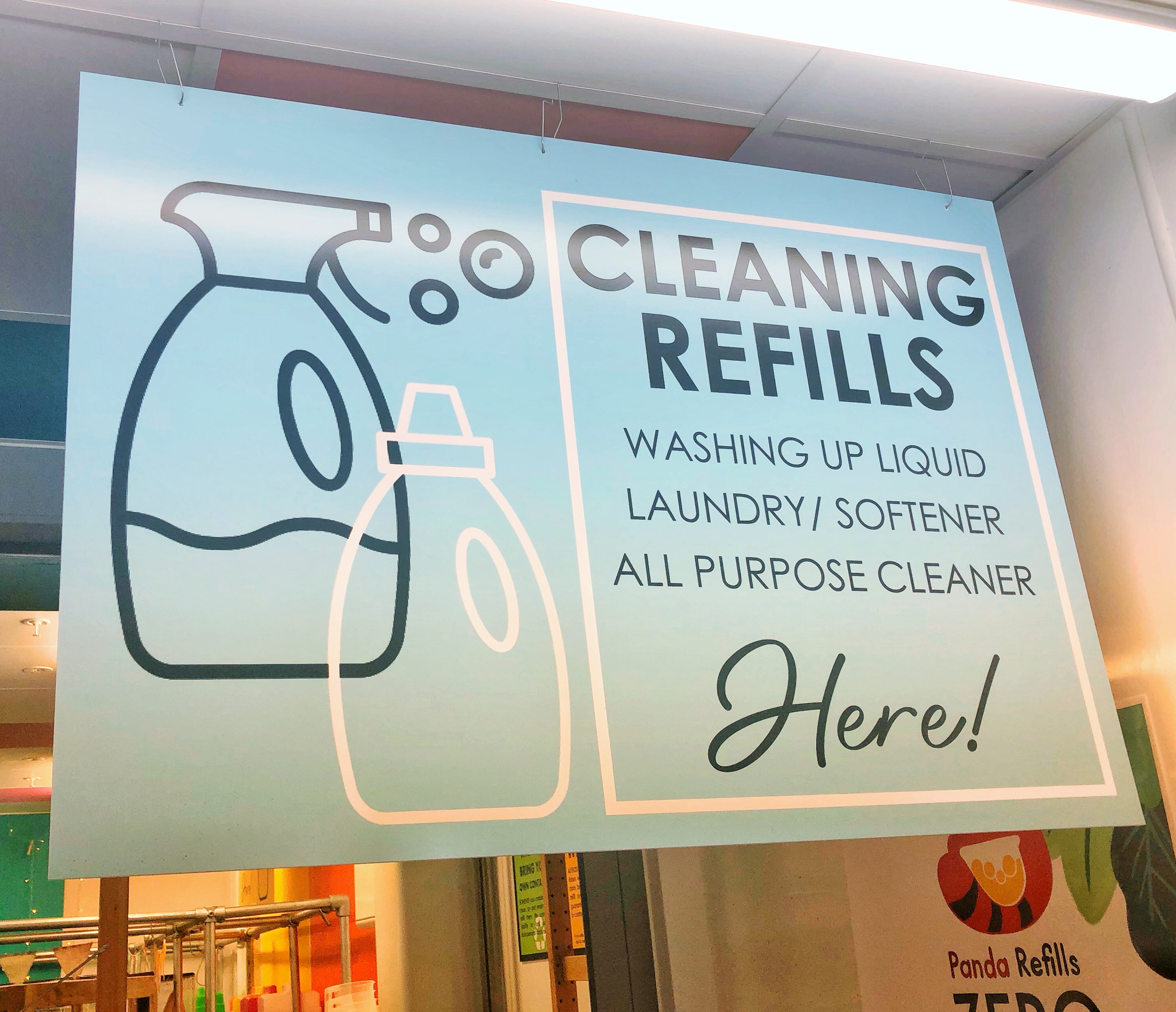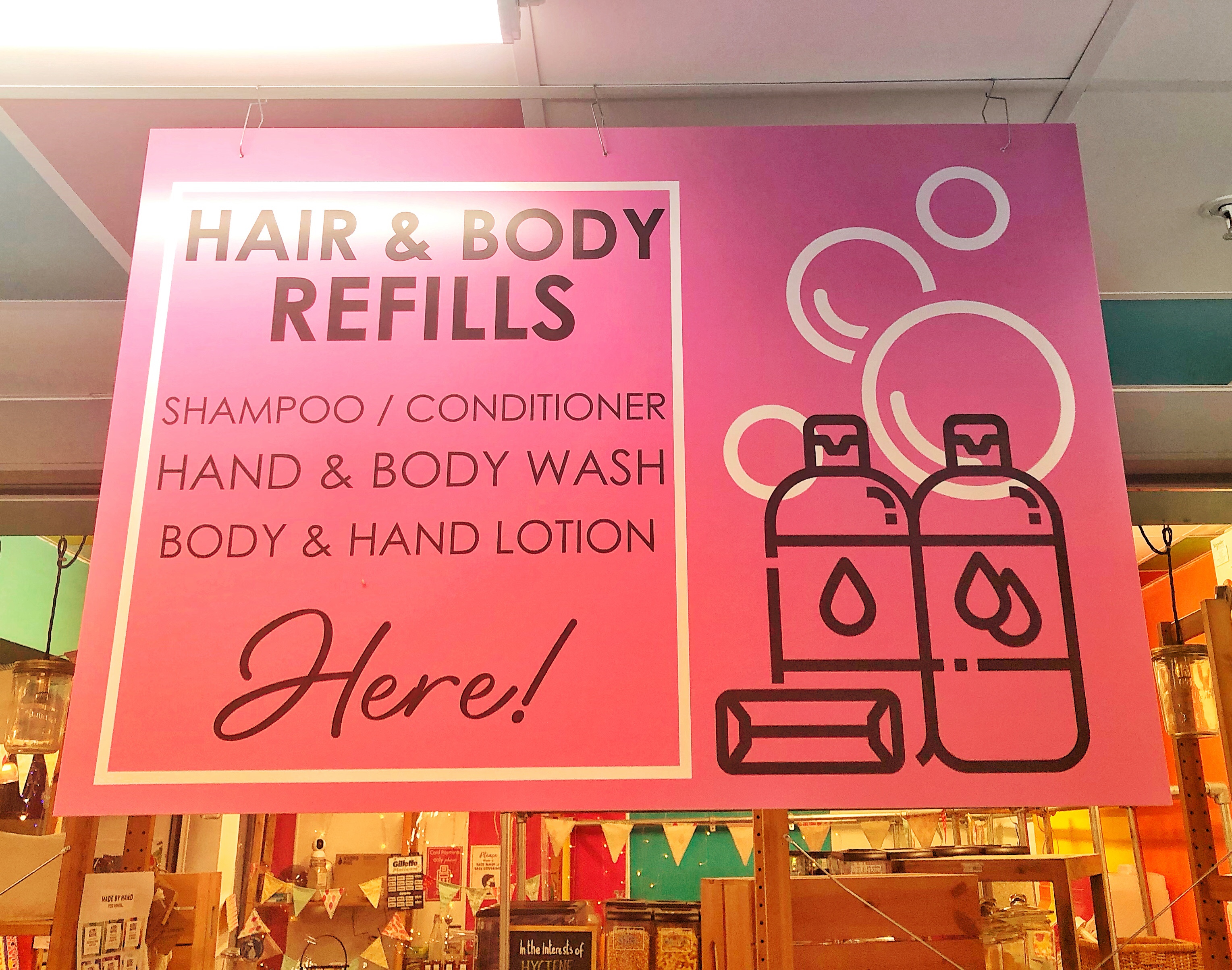
Working on large format printed boards to signpost people to products/reductions/instructions etc. And you need a surprising amount of them
I was experimenting with simple illustrations to add a bit of playfulness online and in the store

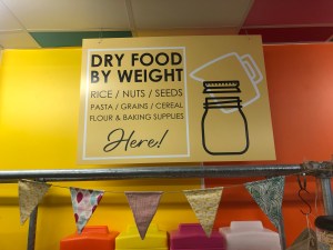
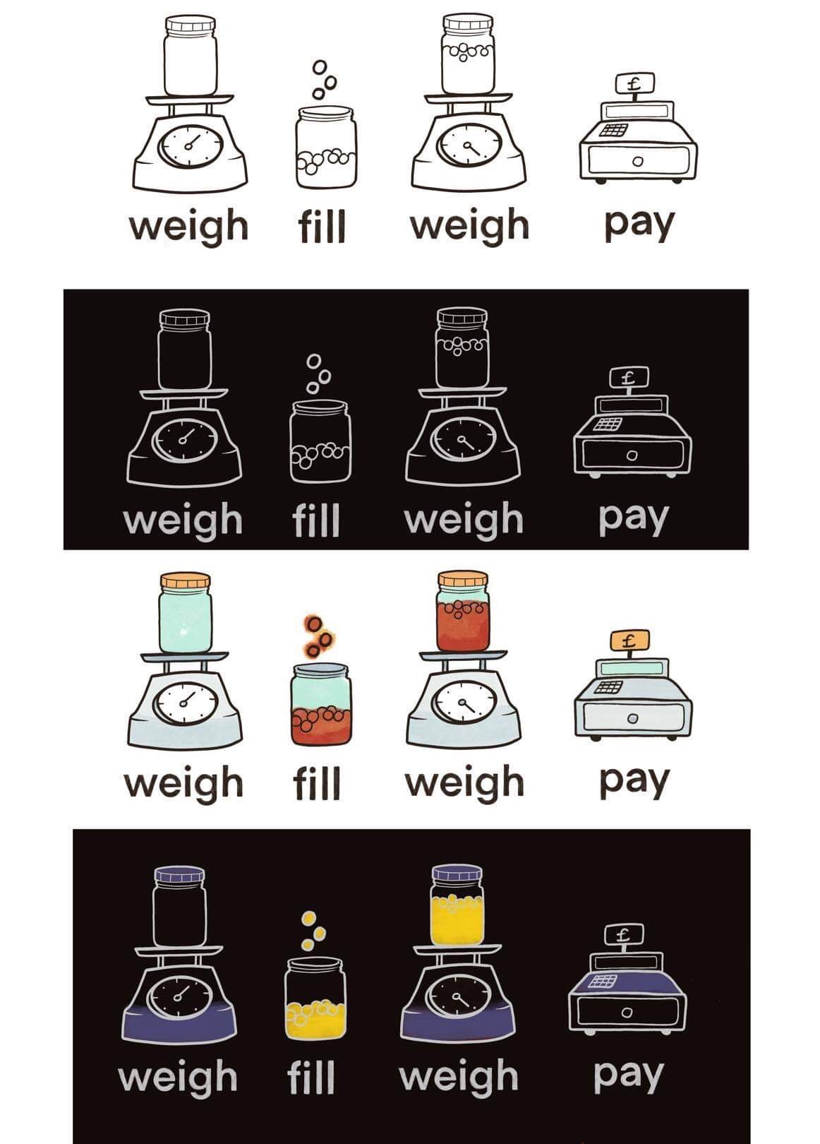
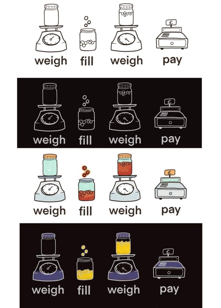
The below images of scales and jars illustrate how to buy refill food when bringing your own containers – the scales and register are completely inaccurate, I’m using recognisable old-fashioned images rather than realistic.
The pasta above is very accurate – that’s exactly what penne looks like
The above were made before I decided not to go with my own illustrations and instead use simpler, ready made line and shape icons for a more solid, uniformed look – they’re quick(ish) to change, design etc.
I designed them with a mix of Futura and hand written type fonts to give a little vintage advertisement feel – all the icons use are free from a popular icon website (or a small fee for a commercial licence) I’ll remember the name later
I overlayed some of the icons on the larger ceiling signs – a white icon over a black one to give a little bit of movement – it made them a little bit more interesting