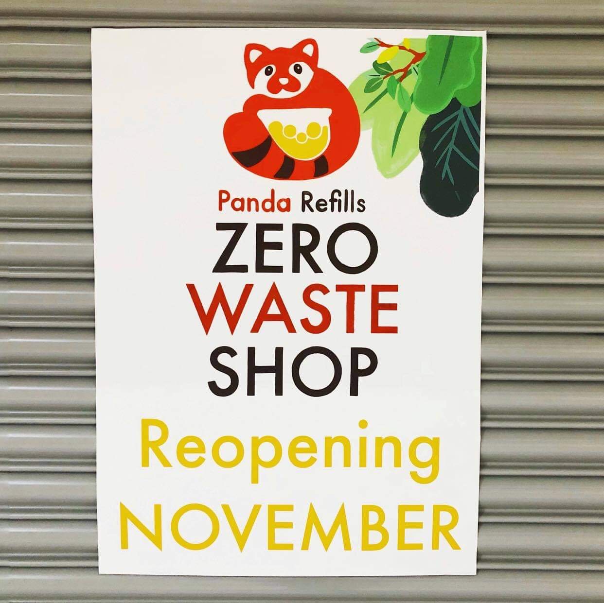
As more health food #zerowaste shops move towards the seagrass green and cream colour scheme – I’ve been using this shop rebranding to move away from it.
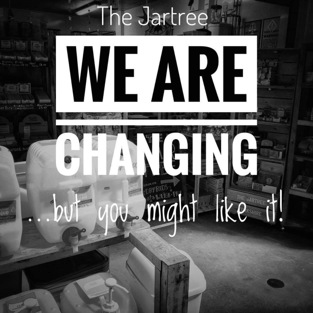
Partly to make the shop more distinguishable online from a quick glance on the social media pages and website, and partly because I hate it.
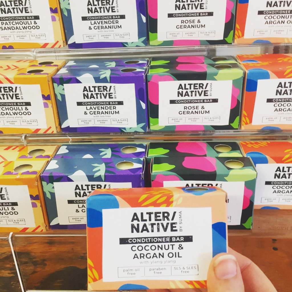
It was ok at the time (2018). But there’s only so much kraft paper brown and clean, natural earth colours one market can take. Though I understand deviation from that theme may harm your ‘eco friendly’ appearance – some brands have made the change by incorporating organic shapes (Suma, alternative soaps) or using bright, but subtly subdued colours or retro styles
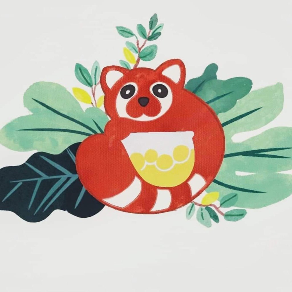
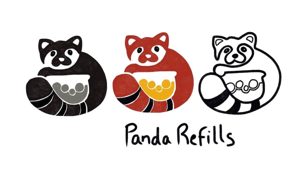
I’ve started with a name change (Panda Refills), added some leaves and a mascot. I keep the ‘slightly hand drawn’ look – this is a small business and not polished. The original Jartree logo was supposed to look like a vintage simple stamped logo (shop old fashioned, traditional)
I’ve been playing with a few different looks from watercolour children’s book illustrations to soften and brighten this – but I abandoned them mostly for harder block colour. I like the round Jartree logo though, so the panda will remain rounded in spirit.
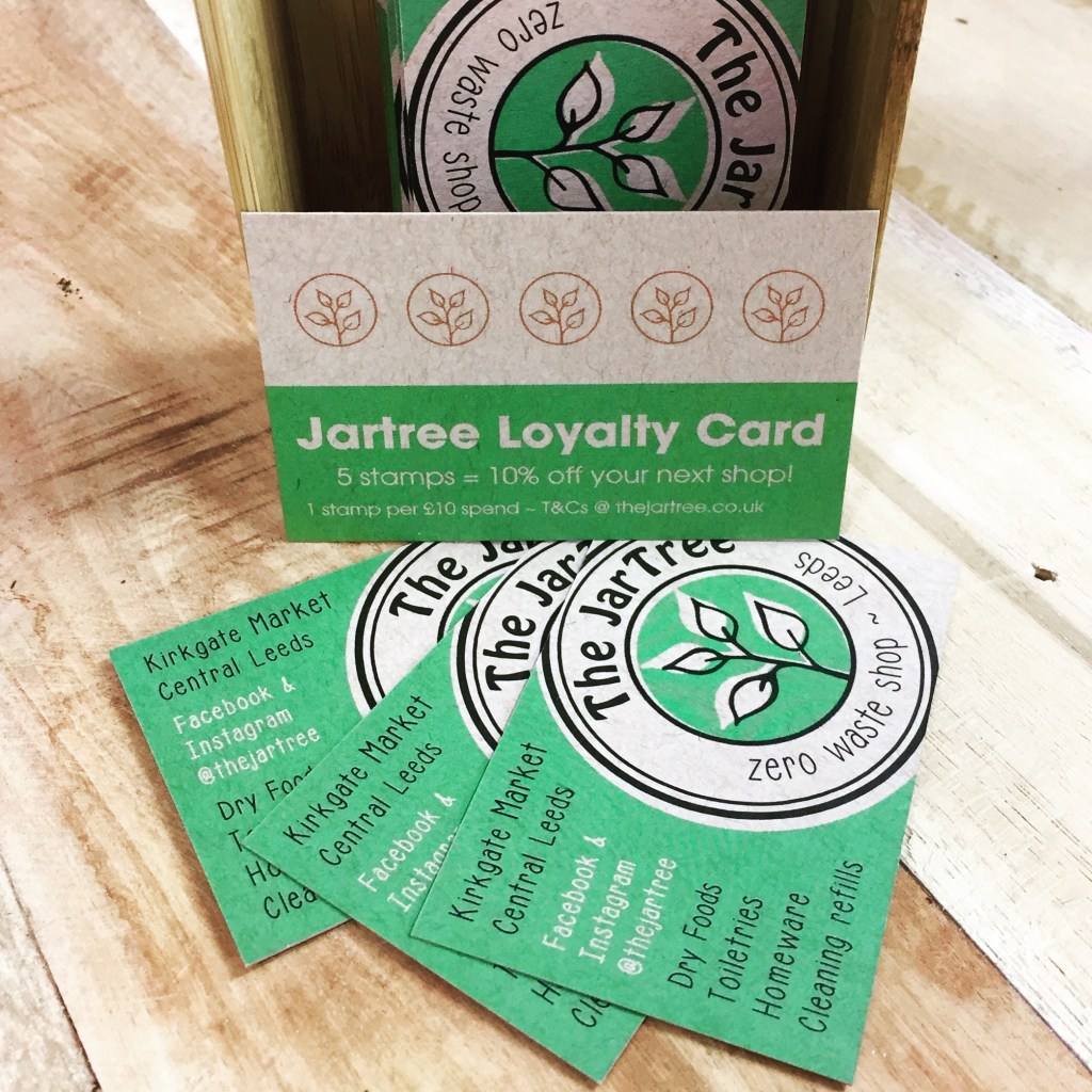
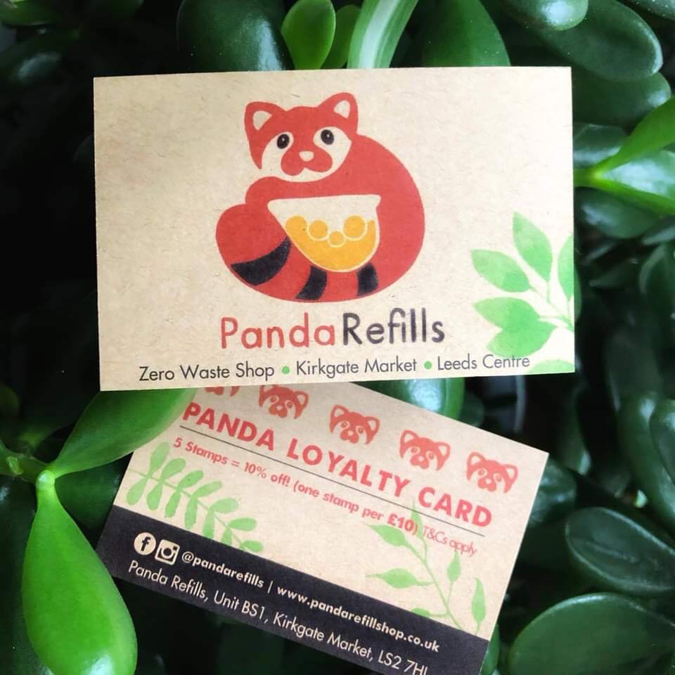
The loyalty cards remain the dreaded kraft paper – but small steps. The font is now a variant of Futura and the logo is sharper, with clean lines that transfer into line-only versions


One thought on “Rebranding the Jartree”