The lockdown art challenge either never ended or has started up again. And there’s nothing to do but sit about practicing styles.
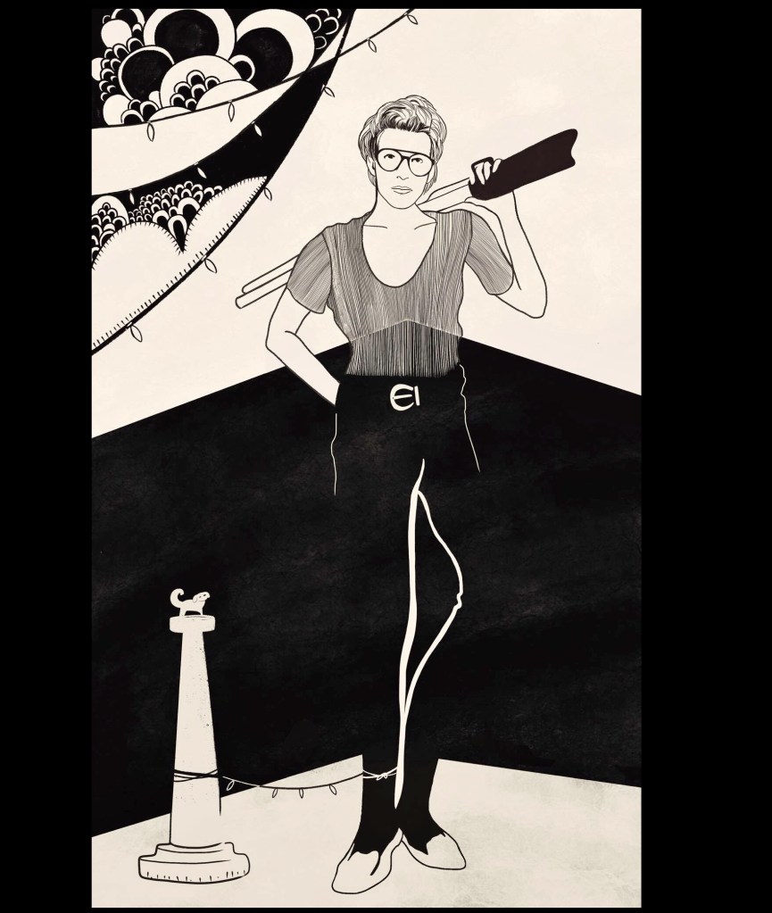
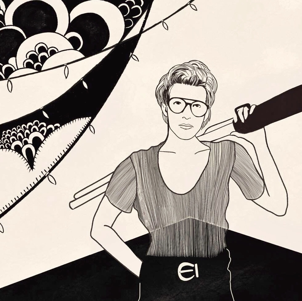
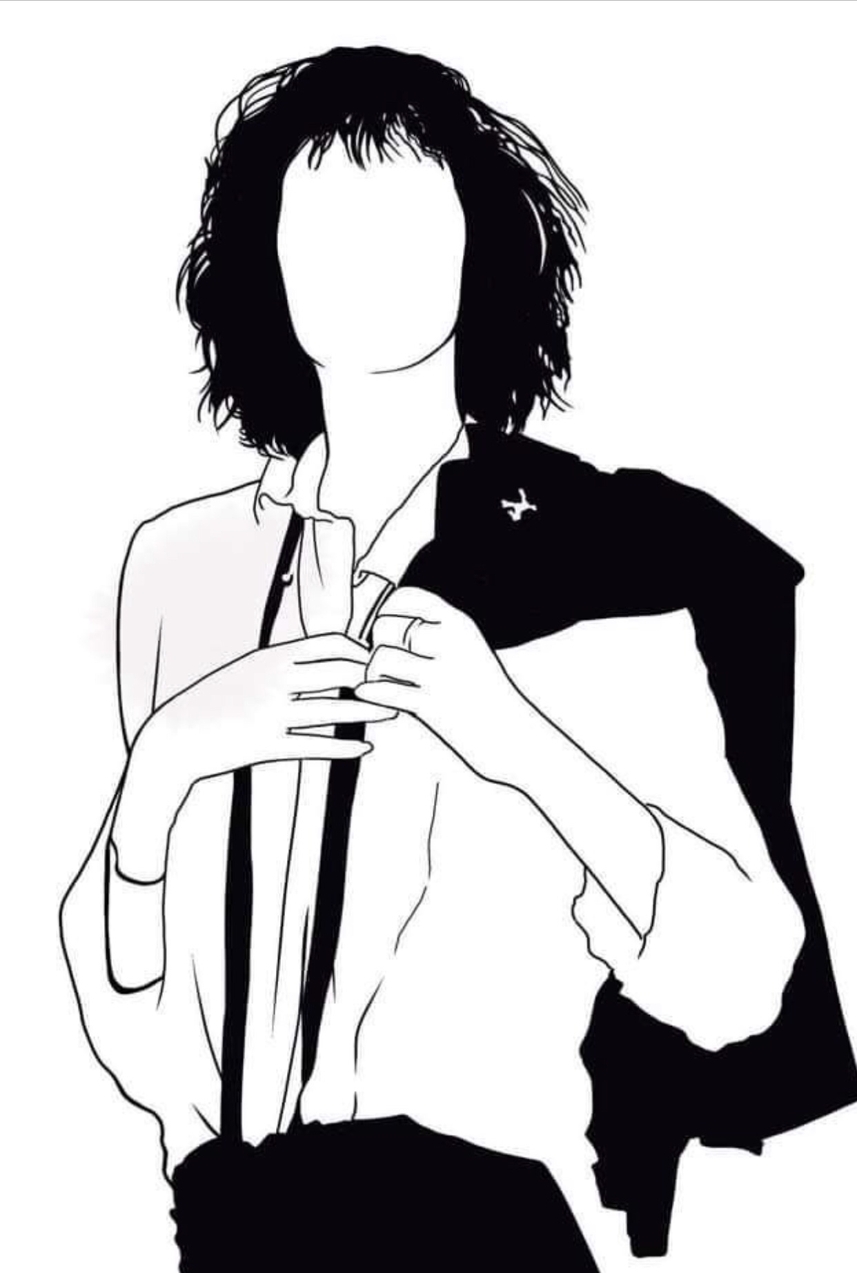
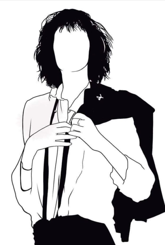
This is a portrait of local Teesside musician Micheal CG in the style of Aubrey Beardsley.
It’s a simple black and white illustration (actually black and beige to mimic paper colours) with elements that Beardsley used in some of his popular more illustrations (a statue, repetitive patterns) – and some more specific for this portrait (fairy lights, a Pekingese dog)
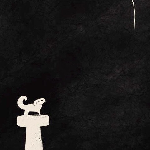
Full image – illustrated Beardsley stylised portrait Pekingese Detail – with texture
I like the continuation of the background (suggested using line density) through the shirt. I also like the little peke statue. I’d try a few other compositions with this style, I mean, if I have the time.
I’ve become mildly interested in ladies with animals and I don’t know why. I just like them holding each other – coexisting in the same space
I pondered on this, reading scraps about it here and there. I did a bit of research and found a lot of classical portraits of women holding animals in art history. I also read a whole book called ‘Cats in Art’ which was good, but unrelated.
Of course it’s all symbolic. A dog is not a dog, since the 12th century those artists have been sticking moral associations to animal forms. Is Leonardo da Vinci’s Lady with an Ermine about purity or wealth? I don’t know, I haven’t looked into it
Either all these women are holding pets that they’re very fond of (and often seem more emotionally close to than the other people in the paintings) or they represent something everyone at the time was well aware of, but we’ve since lost the context. Also meanings change between time and artists and subjects, obv.
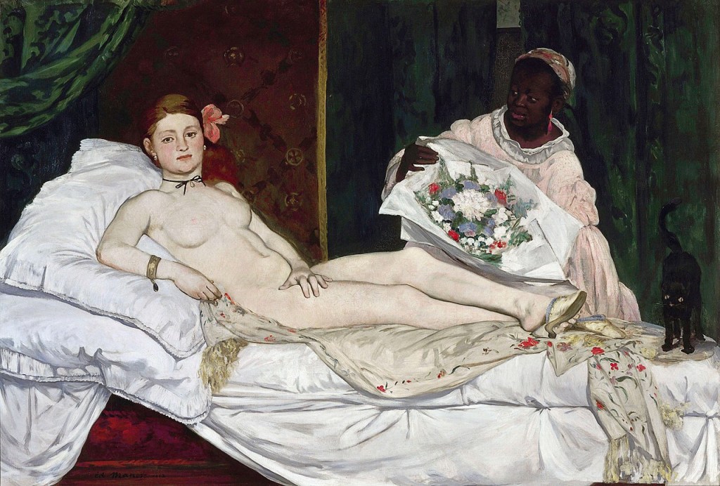
What was that painting of the prostitute where the artist had added a black cat with its tail up as an in-joke about erections? Can anyone remember that painting?
Olympia by Édouard Manet
Meanings change: Domesticity, irreverence, virtue, wealth, symbols of youth, ideology – to delightfully lighten the mood of a painting, or illustrate death and suffering.
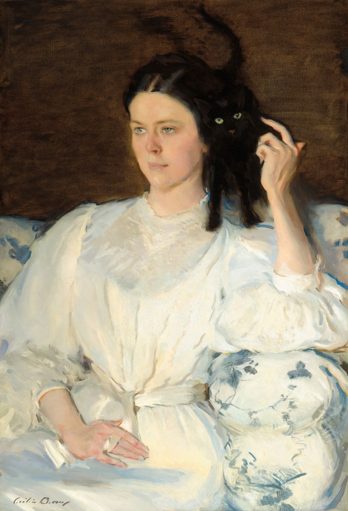
I don’t know anything about Sarah Allibone Leavitt – also I never will. But from this portrait composition I’m guessing she was probably a witty, independent (*historical restrictions not withstanding) lady. I don’t know her, but I’m getting a feel for her personality here.
Is the cat going to sit in your lap for the portrait? No, the cats gonna do what it wants, and so will I.
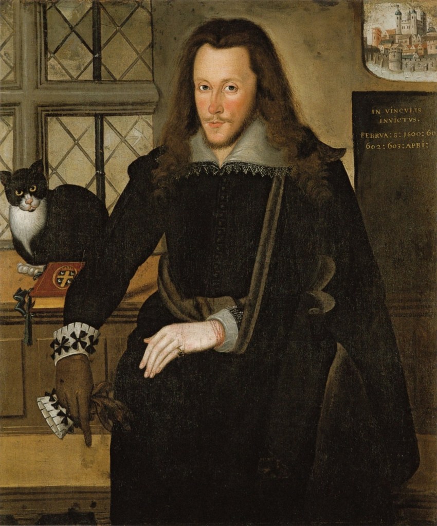
Cecilia Beaux portrays the artist’s cousin, Sarah Allibone LeavittHenry Wriothesley, Earl of Southampton was cellmates for a while with his cat. And you can tell how the cat felt about that from this picture
I’ve done a few sketches and paintings around this animalistic theme – testing it. Nothing is quite right yet, and meanings vary wildly. I’m really not one for explaining the emotions, feelings, meaning or narrative behind images – for one, it’s entirely subjective to the viewer and their pre-existing experiences
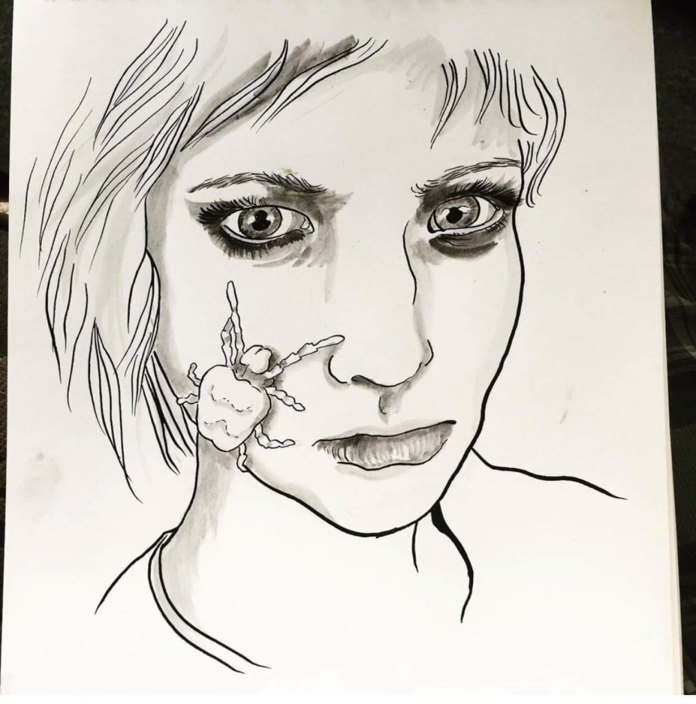
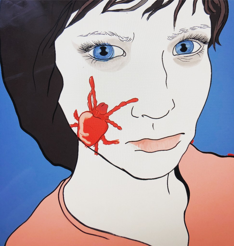
Sulky Lady with a Red Spider Mite – did you know all red spider mites are female and totally harmlessMy wall of ladies and animals (ink, watercolour, charcoal, etc)
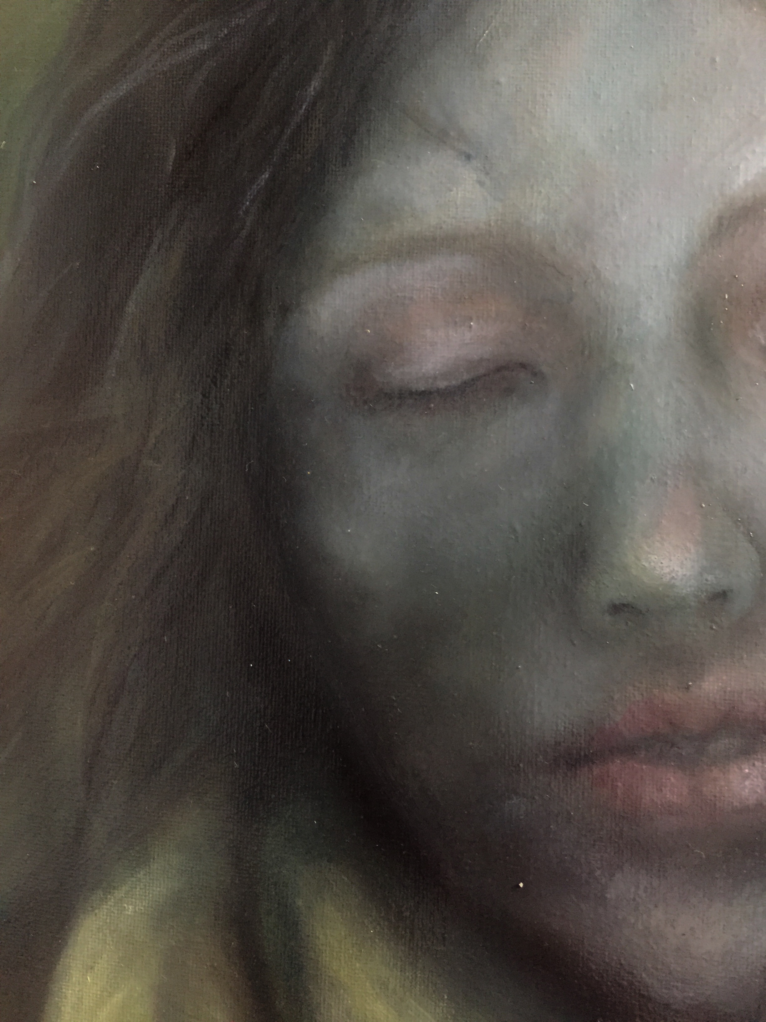
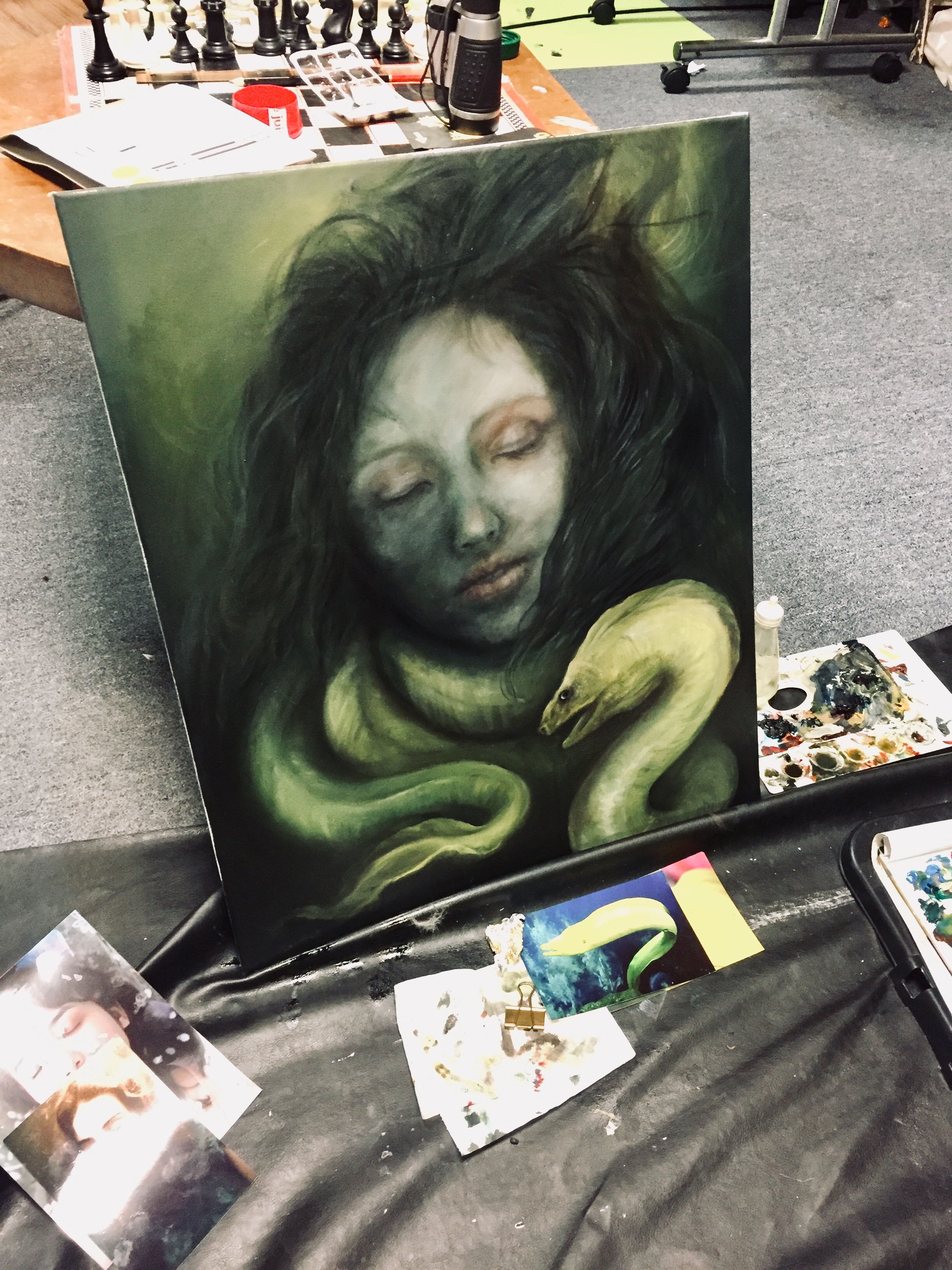
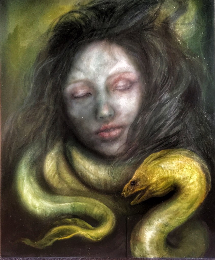
I can’t remember the name of this painting – I finished it in time to be part of Pineapple Black galleries 2019 Summer Show (edit, I remembered) – it’s definitely a dark narrative, but she seems at peace with it at least
Statement: ‘Morass’ (oil on canvas) Morass is one in a series of portrait paintings (‘Meshed’ series – oil paintings & ink illustrations) (Meshed) uses classically influenced portraiture styles, materials and compositions, combined with often offbeat colours and symbolism. Rather than a traditional artistic representation of the subject, the portraits represent a feeling, mood, emotion or story; creating small, often conflicting, and occasionally dark narratives.
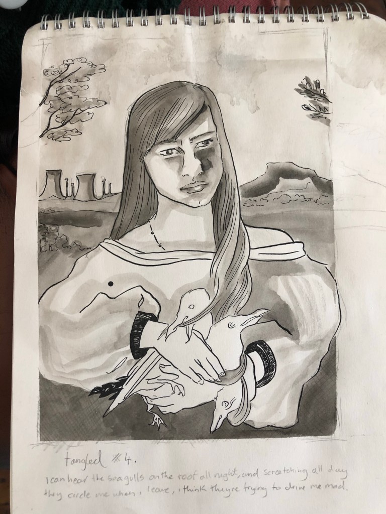
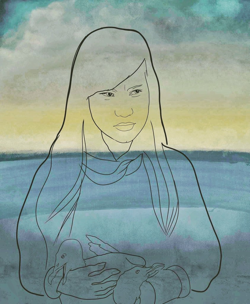
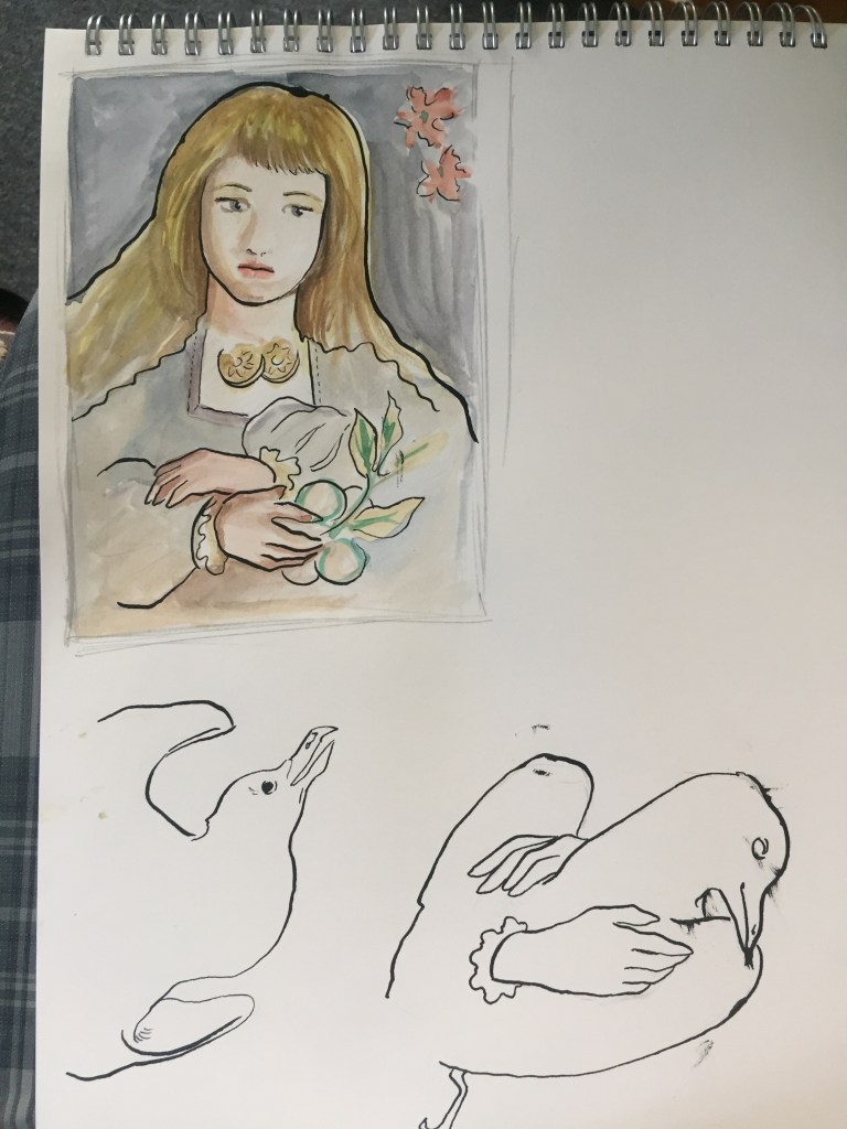
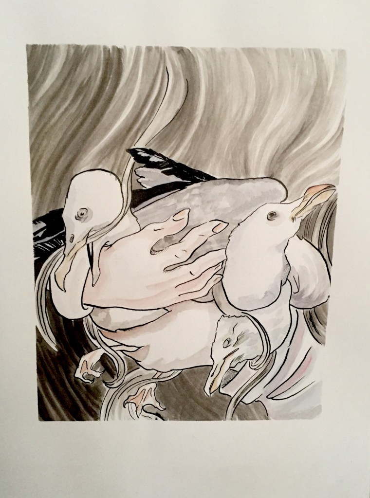
I have this idea for a situational, fundamentally ‘teesside’ image – but sort of classical painting. 16 century teesside. With a low value animal, being choked to death by the unconcerned lady.
There’s a lot of seagulls around the studio – because of the proximity to the Tees, and they nest here. I can hear them in the roof and I associate them with this place. It’s annoying, I want to choke them
But also in a very real way, there’s an environmental factor. I think a lot of pollution and damage to the environment and that seems to be more of an influence these days. I’m working through sketches at the moment – we’ll see how it goes
Yeah so would I – but here we are. Doing the best we can under time limits with only a phone camera and a photo editing app.
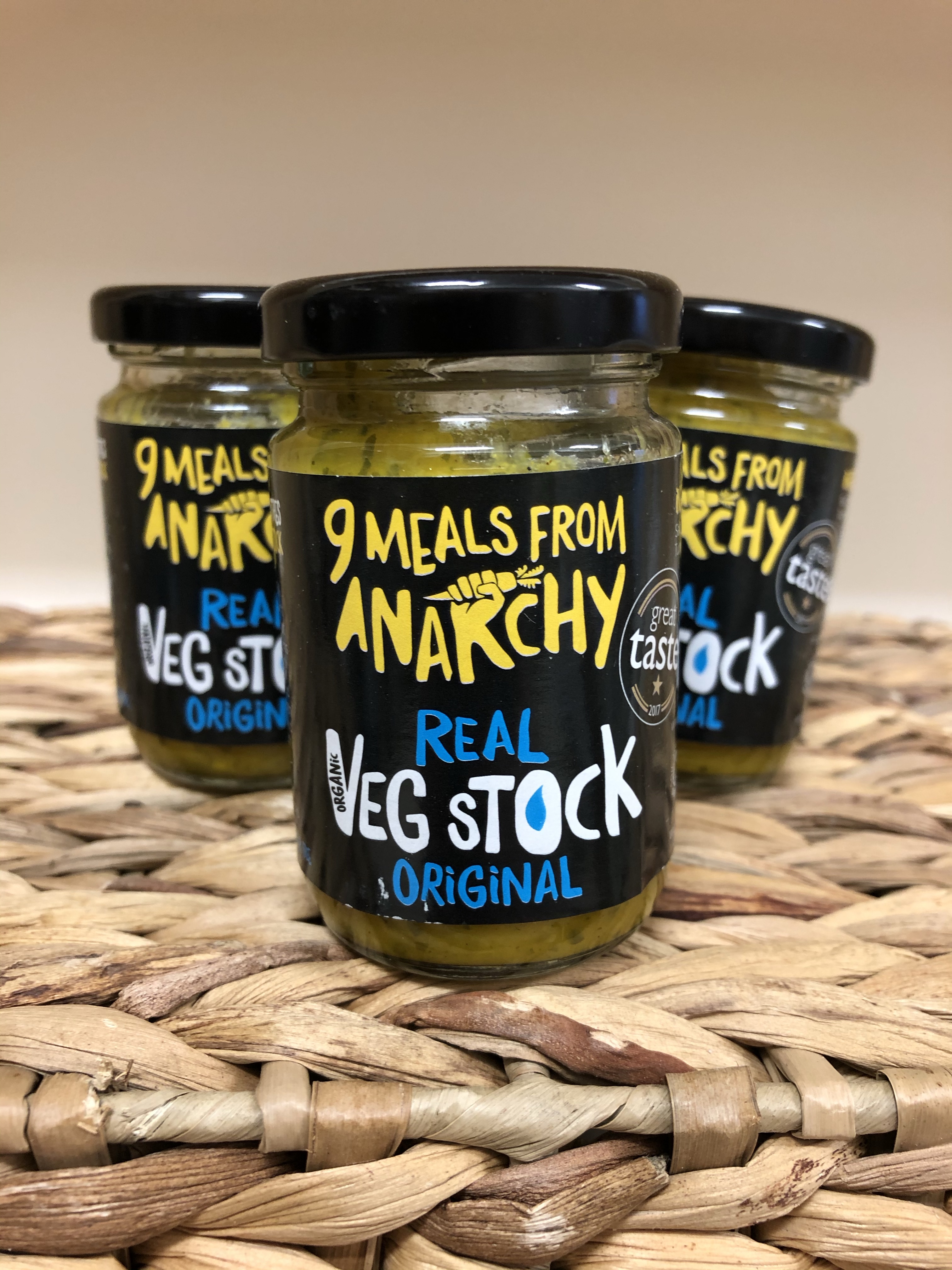
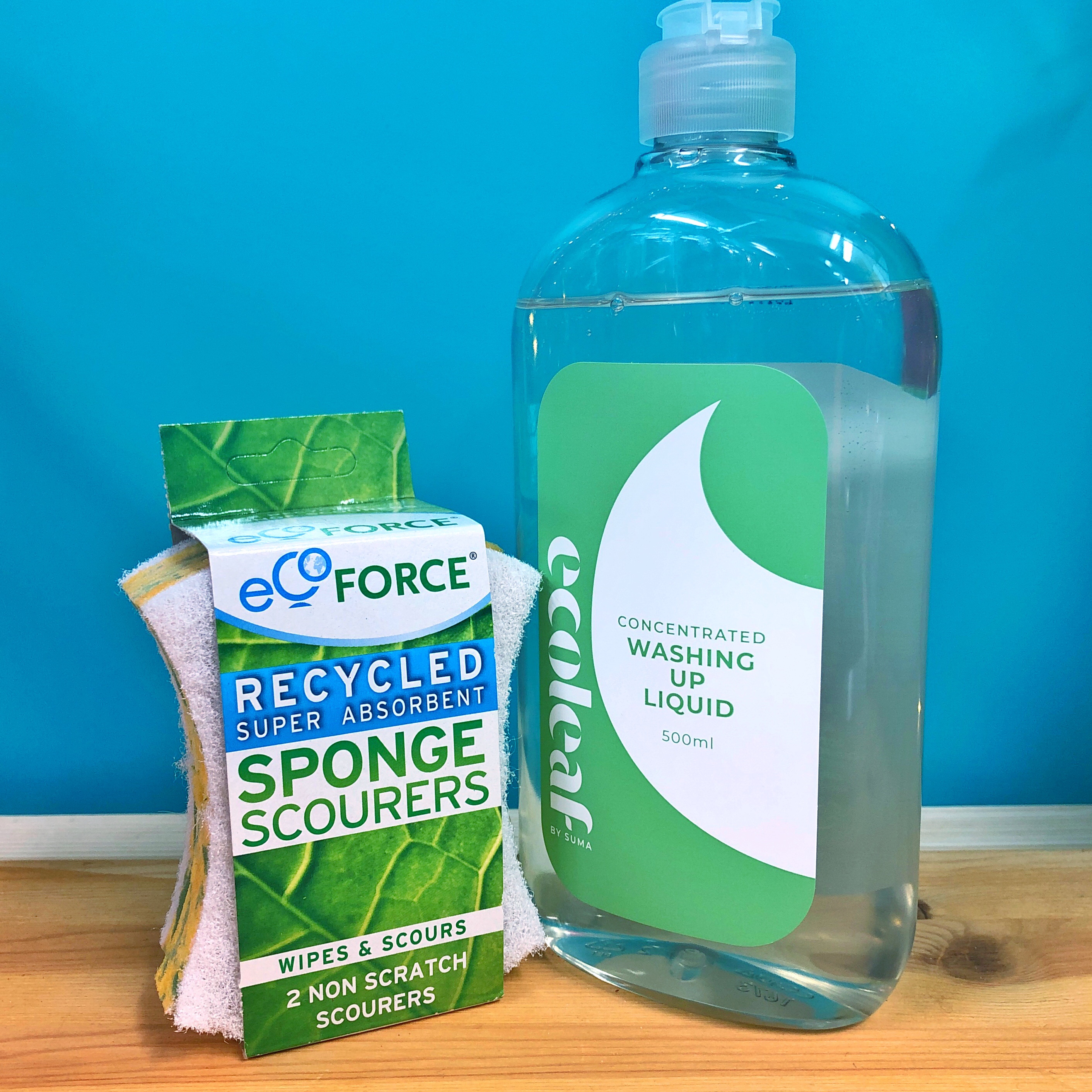
I want to represent ‘eco friendly’ products, but not in a sea-green, natural, Kraft paper way (I’m not a fan of that) but in a more… ‘The Future is now, 50s/70s optimism’ kind of way. With the colours bold, space around the products (but the products aren’t in their natural environment) – and you can almost envision a spikey, star shaped sticker at the corner of the image proclaiming how NEW! the product is…
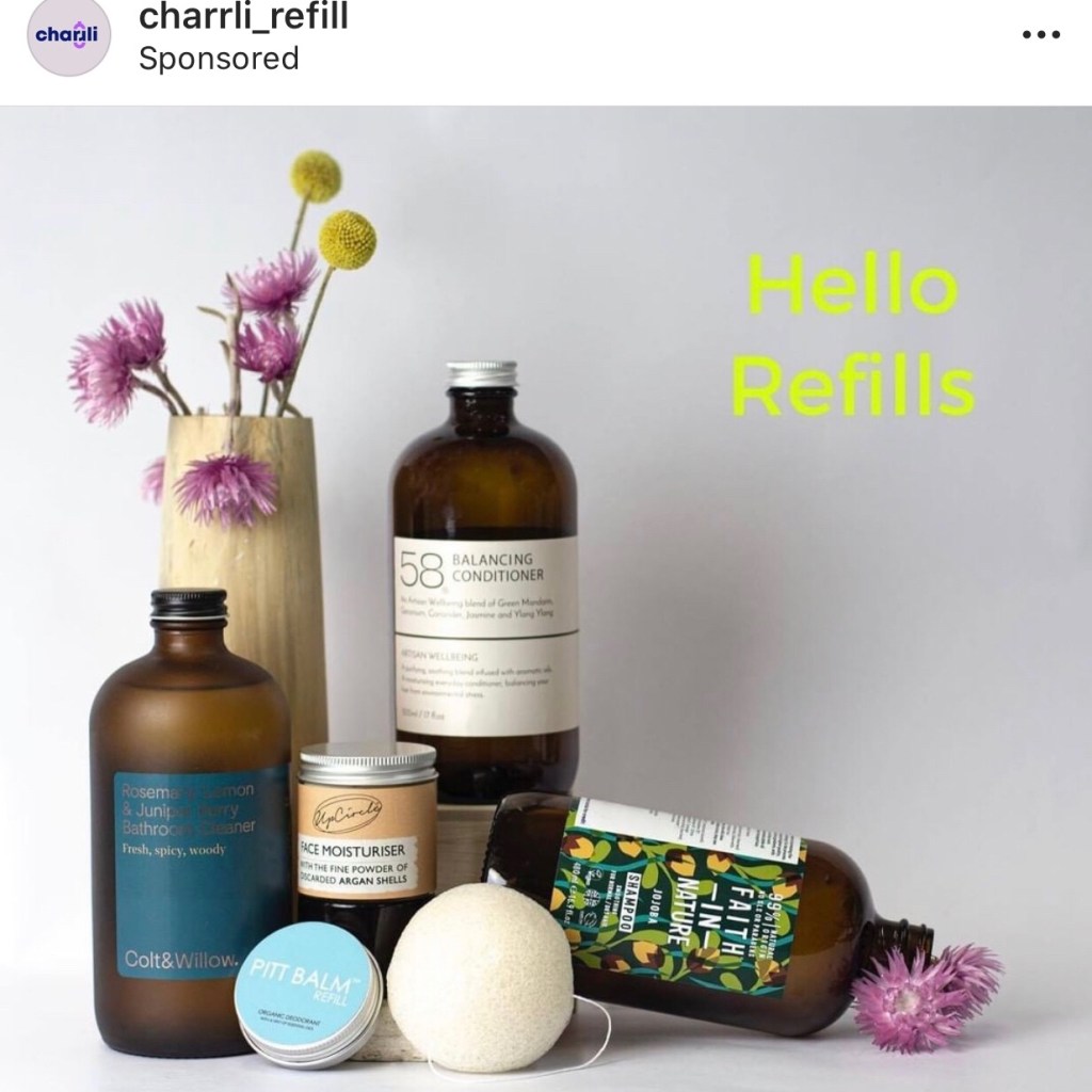
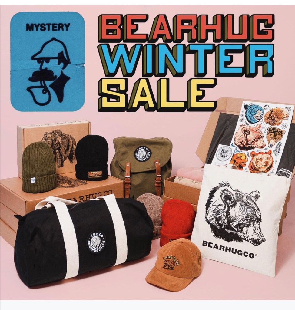
This is a good example with by charrli_refills with muted purple and fluorescent text – but to me it still seems a little coldAn excellent example and something to aim for by The Bear Hug co. – great matching background/foreground, and retro fonts
Hopefully in the next few weeks I’ll have time to set up some proper shoots with the products and an actual camera: lighting is needed to get rid of the shadows, we need some weird fake environment backgrounds or totally clear backgrounds or something
In the mean time it’s block colours, bright backgrounds, a few filters and some jaunty angles
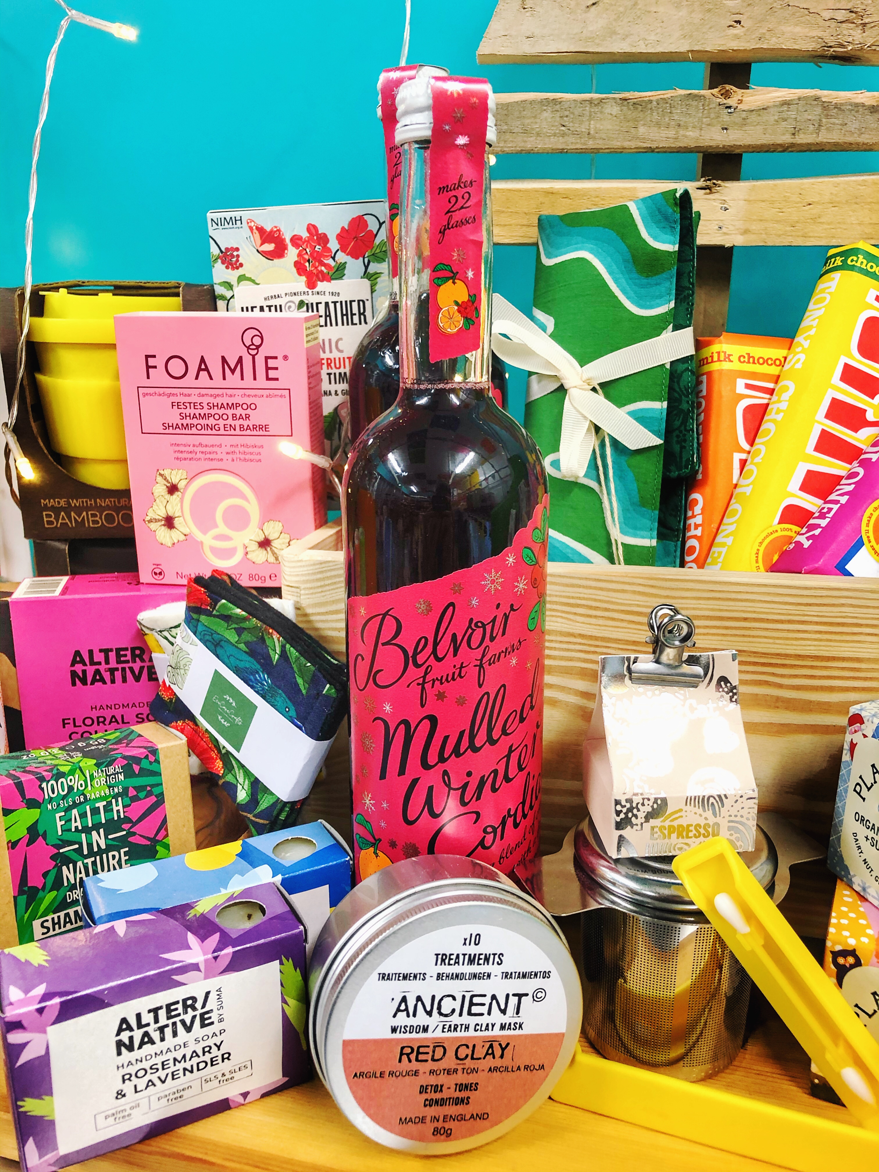
I’ve used a mix of home, health and food products to communicate the range of different things we sell – all close up ‘refillable’ food shots adhere to a square to be uniformed and fill the whole frame; communicating the supply of them is endless, AND to give a close up of the product as people sometimes don’t know what product they’re looking for and only know it by sight (for example, the difference between porridge oats or oat bran)
All none foods and packed items have space around them to give an idea of size, and shape. And to make it clear they’re individual items. Though sometimes they’re grouped with variants to show colour differences, or similar complimentary products.
First chance I get I’ll be taking pictures of sanitary towels, stain remover blocks and bars of chocolate in one pic, and everyone will know what I’m getting at
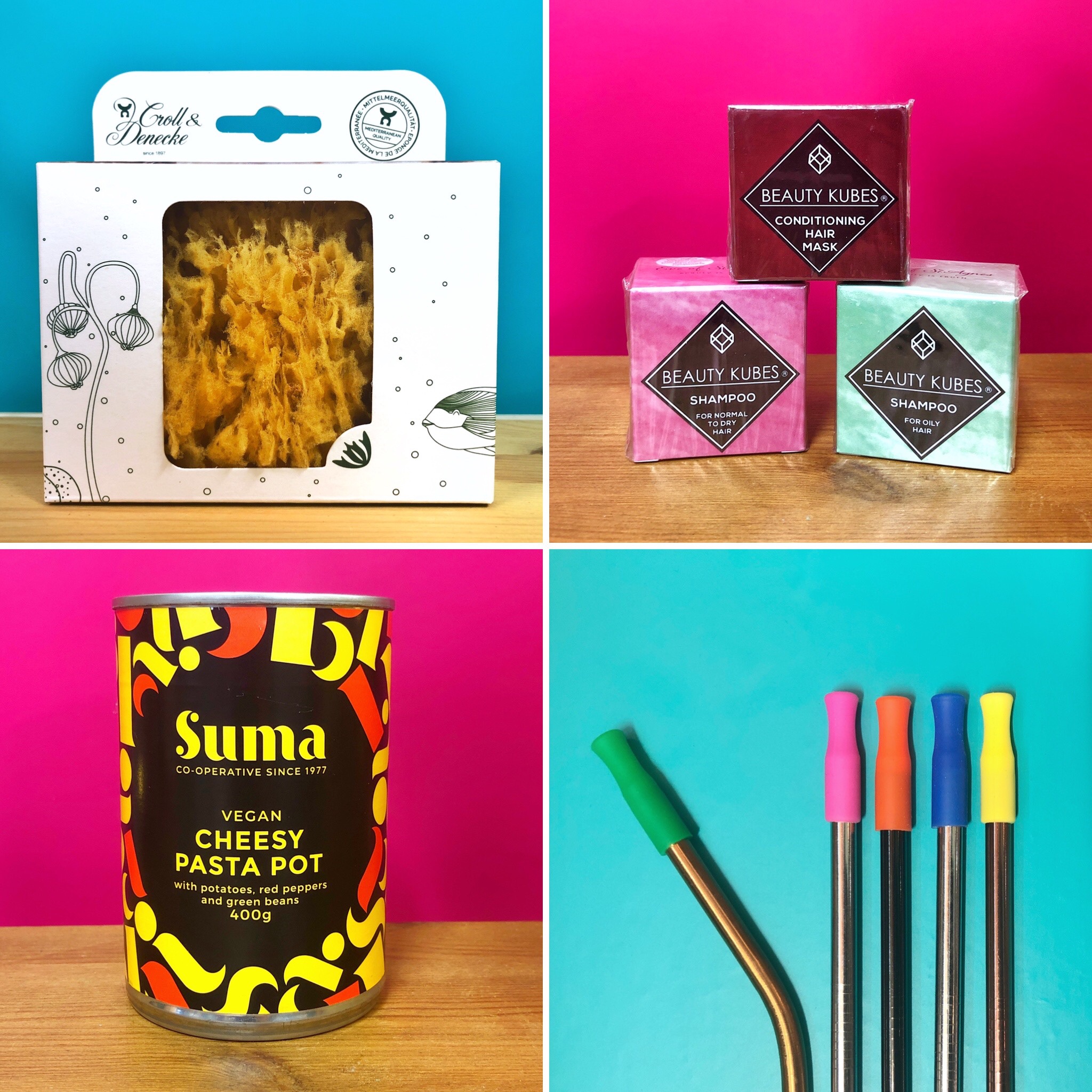
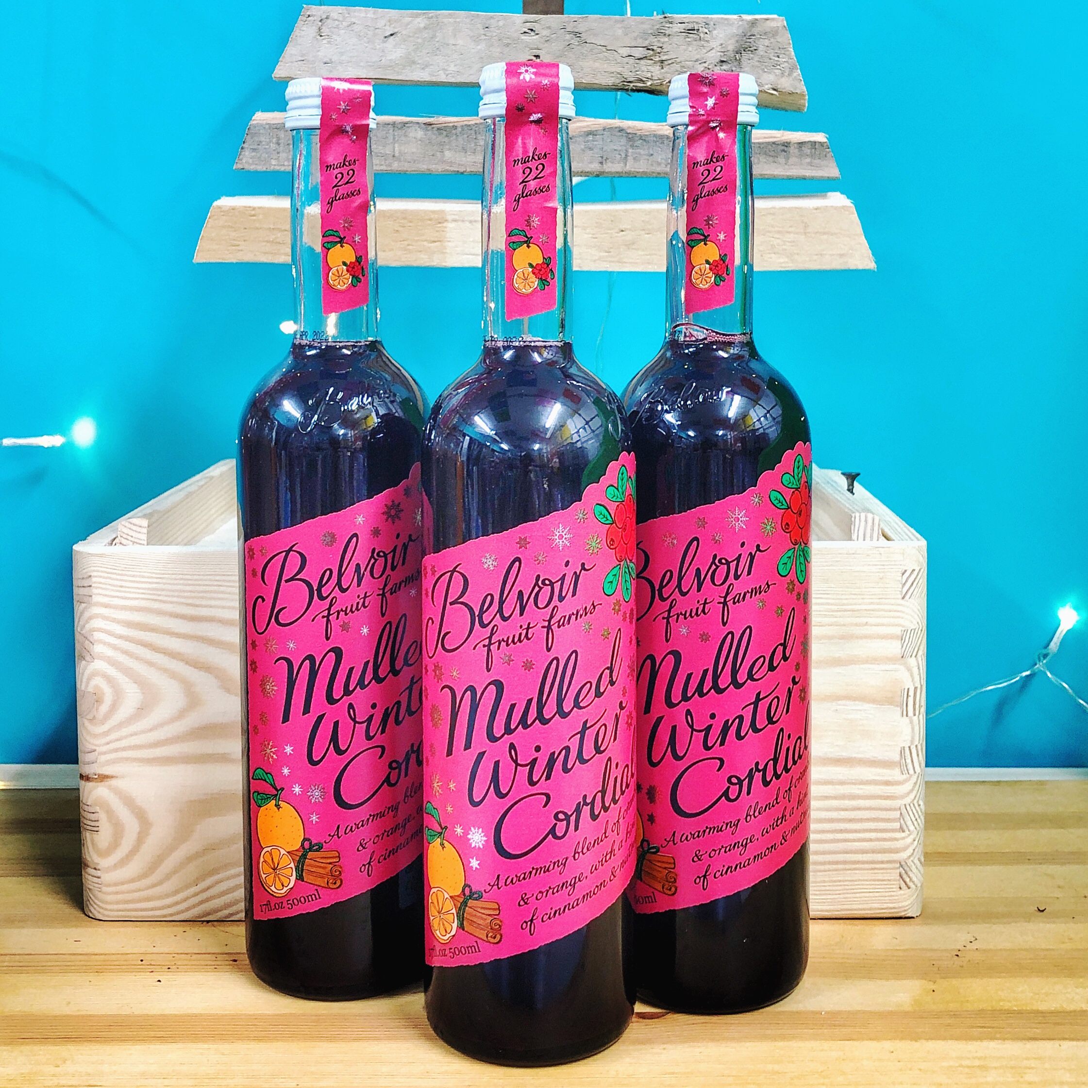
My current product photos – doing the best we can. Clean, bright, intense colours etc.
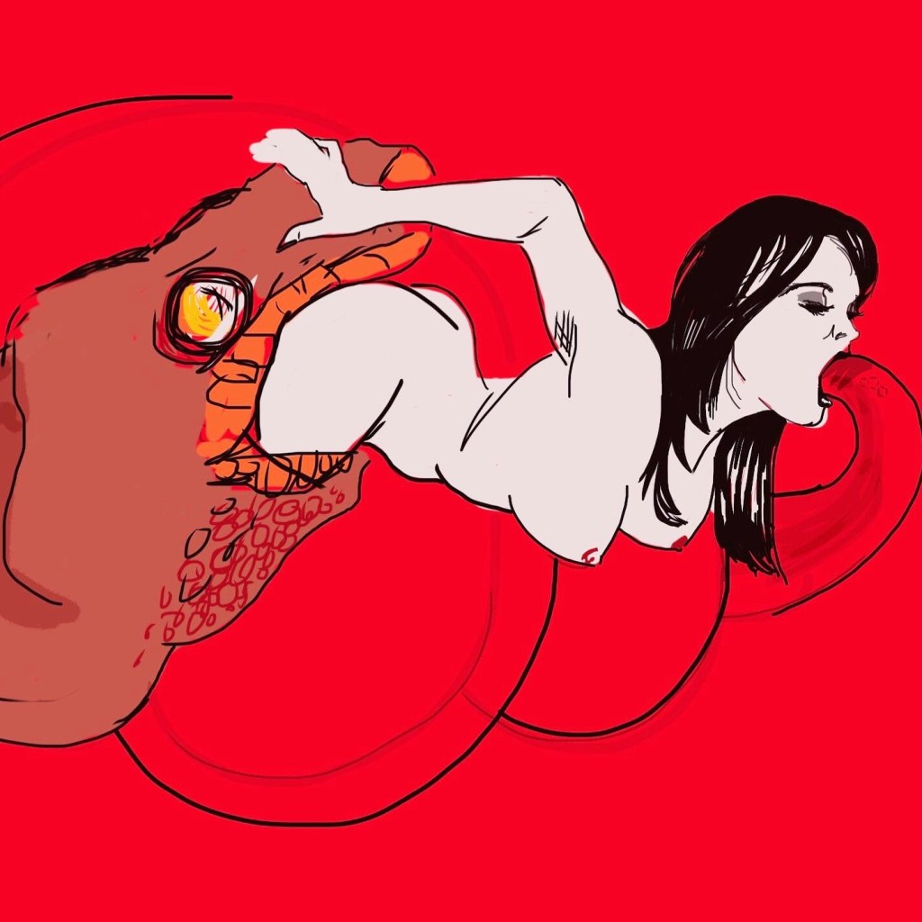
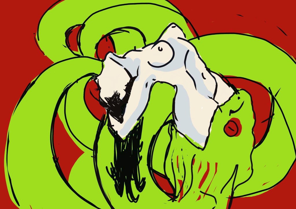
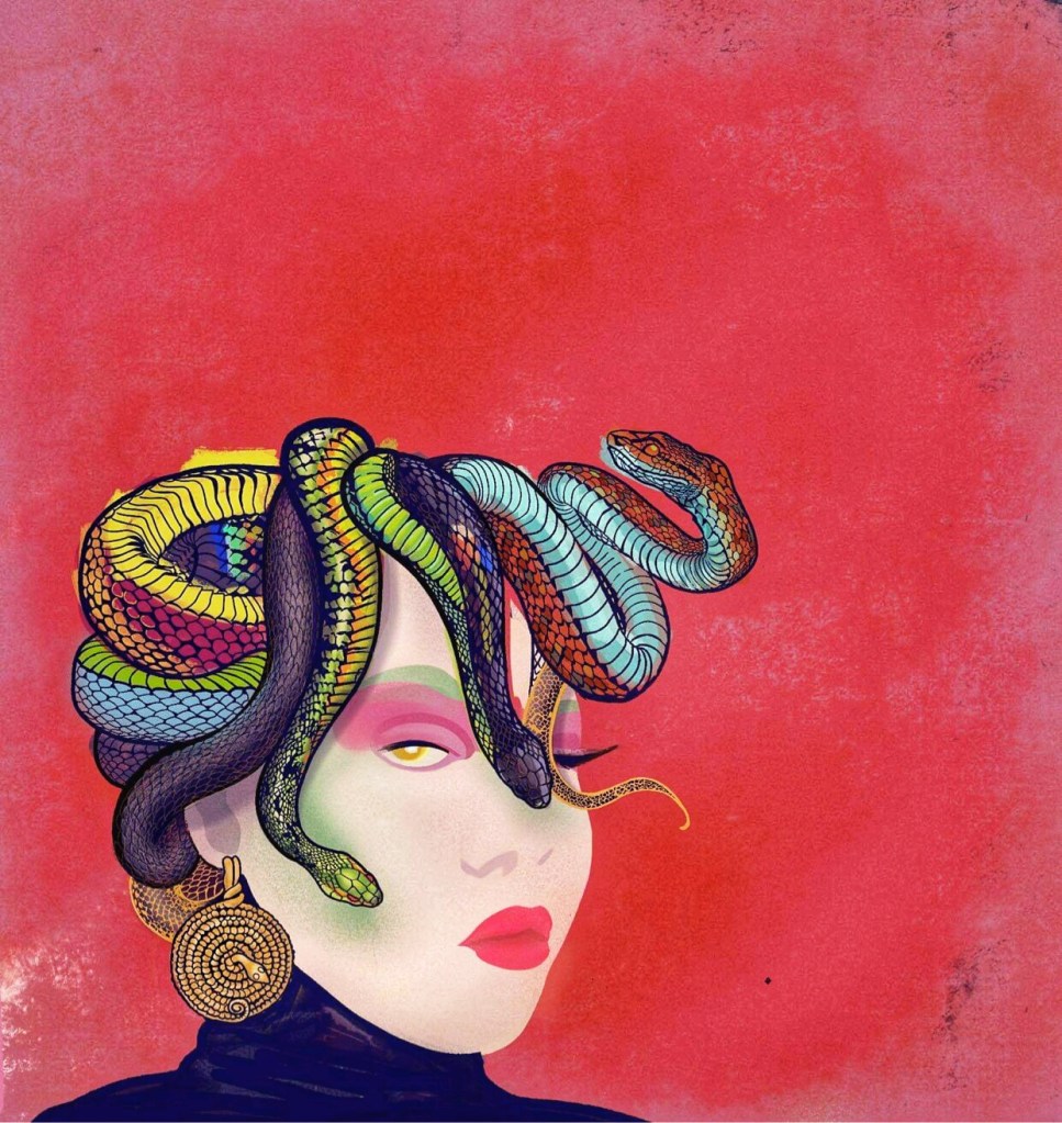
I’ve been playing with a few images that interest me – specifically Medusa and her snakes.
Everyone knows the main story of Medusa (turn people to stone), and then everyone will correct you on the story of Medusa to highlight the female misery aspect. You’ve got rape, then being cursed, then killed etc. etc.
But I’m interested in the shapes, colours, lines. If you work out your aesthetics first, you can add narrative and symbolism later. Have nothing in your houses that you do not know to be useful, or believe to be beautiful said Mr Morris; purveyor of fine wallpapers.
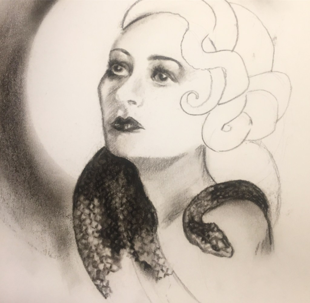
What a terrible thing to take a tragedy tale and make it all about aesthetics! Haha, so from a purely aesthetic point of view, I’m looking at imagery from the twenties, art nouveau, etc.
Pencil sketch based on 1920s photography
I’m also interested in Japanese erotic art, advertising, vintage comic books, Instagram influencers, vintage textures, imperfect representations, aspirational imagery, personas.
And also accessories…..I’ve done a few images in the past where women are using animals as accessories to either represent their interests or an emotion. I don’t think Medusa’s snake are accessories – they’re a fundamental part of who she became.
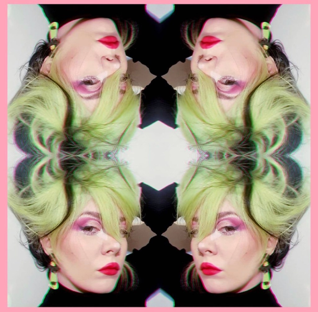
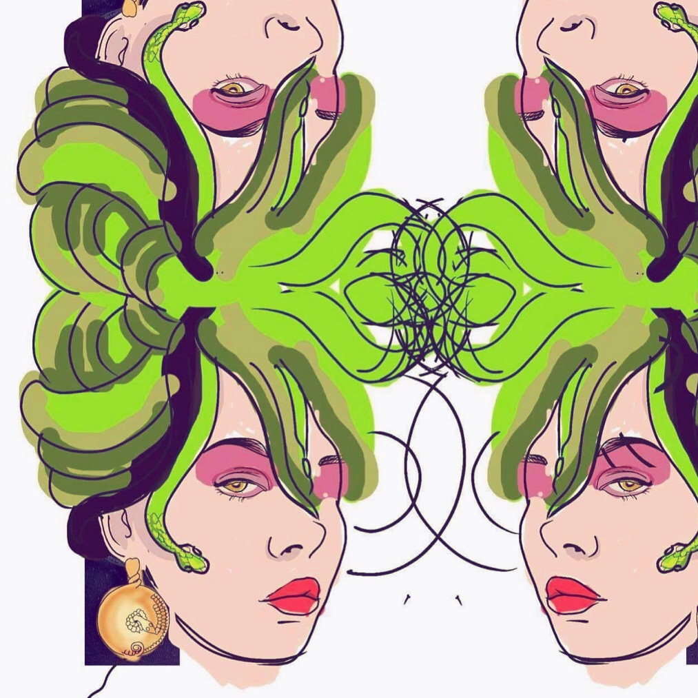
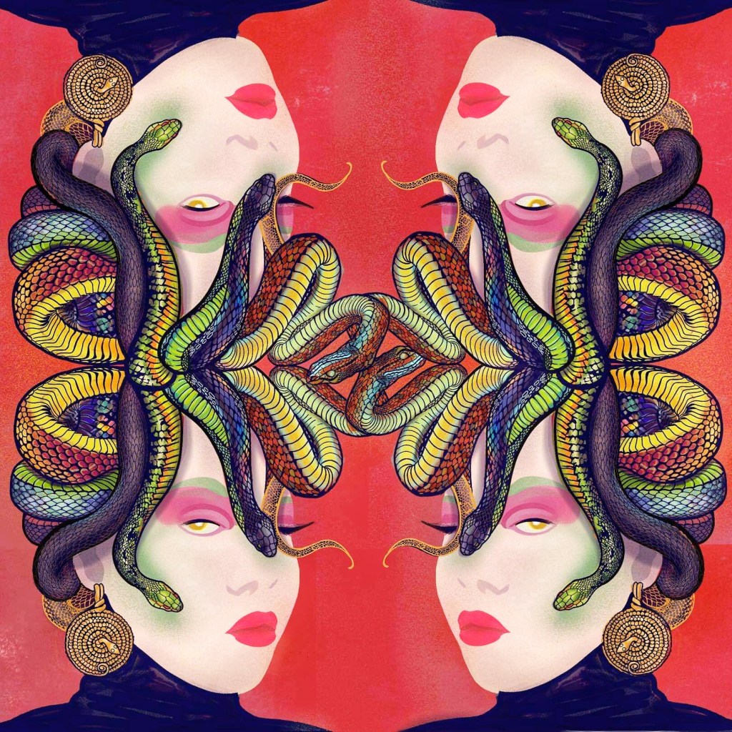
I found an image (selfie) that interested me by a local musician/artist who presents a vintage 60/70s style with make up, props, adornment etc. and used that to start on an illustration. She’s used a filter to turn the selfie into a multiple symmetrical image (don’t know what that’s called, there’s an app for that ofc.)
Instagram @velvetwonderhound glamour selfie
What is she trying to say? Is it about ego? Whats the process behind taking your face, and stylising it to fit your persona, and then duplicating it, and duplicating again endlessly on Instagram. If only we could ask her by literally DMing her. But let’s not bother, and just take her face and create our own narrative
(Note: obviously I messaged her for permission to use her image for the basis of an illustration – I’m not a monster)
Sketch, symmetrical arrangement based on an Instagram image
It reminds me of the art nouveau intricate plant based patterns, but with a 70s pastel colour scheme – baby pink a garish green. Nice.
I’ve been sampling colour pallets from pop-imagery. Old comics, advertising, and propaganda.
If you can call propaganda pop-imagery. I do, it’s very popular.
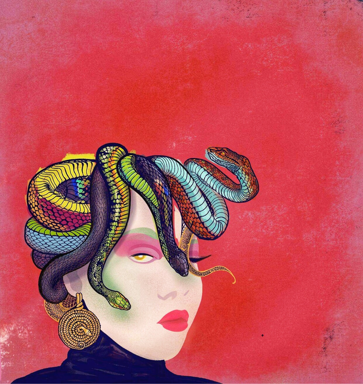
All images that I looked at for colour and textures – mostly modern re-imaginings of old stylesDrawing – A Medusa with texture
The final image combined a lot of elements; – nouveau style and gold-like details, vintage colour and aged, imperfect textures, a collage cut out face, and a bold modern aspirational composition- and by that I mean she’s meeting gazes with a side eye that suggests you wish YOU had a head of snakes.
The images aren’t exactly identical, and the colours don’t exactly match the lines. I made a slight clunkiness to the cut-out colour features (especially between the face and turtleneck) and details here and there to suggest mass reproduction (but printed, the original Instagram)
Digital duplication – final image
Don’t you love my luxurious gold snakes? Do you want some snakes?
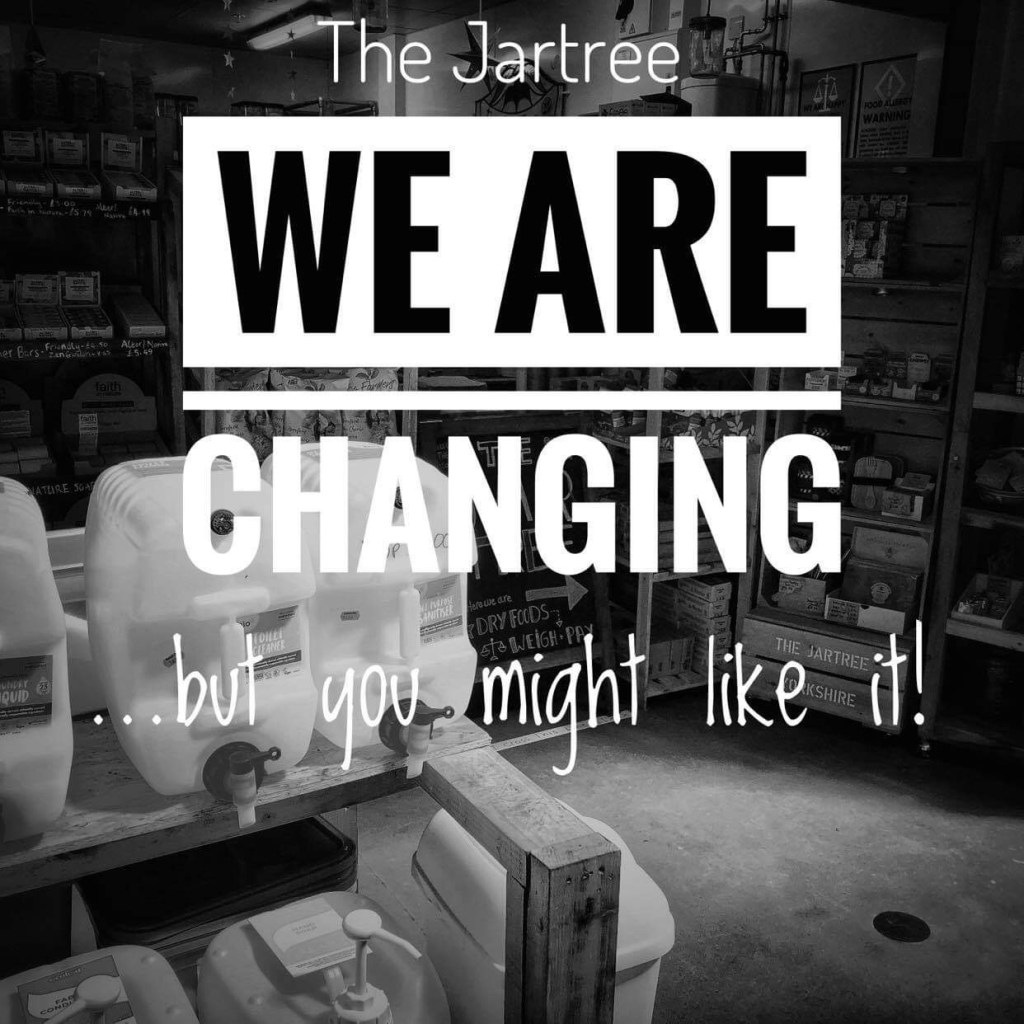
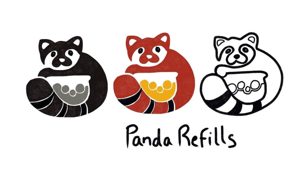
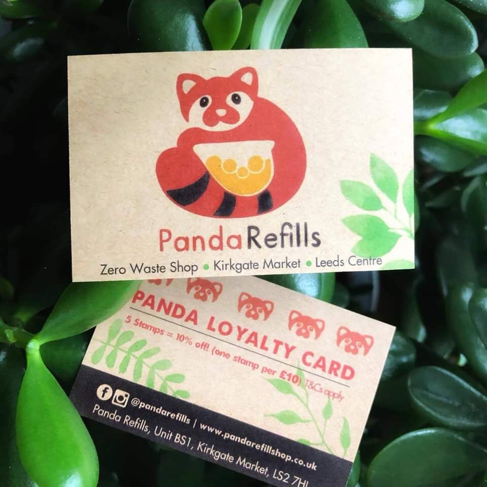
As more health food #zerowaste shops move towards the seagrass green and cream colour scheme – I’ve been using this shop rebranding to move away from it.
Social media post – shop background
Partly to make the shop more distinguishable online from a quick glance on the social media pages and website, and partly because I hate it.
The Jartree original colours – proudly made on publisher in 2018
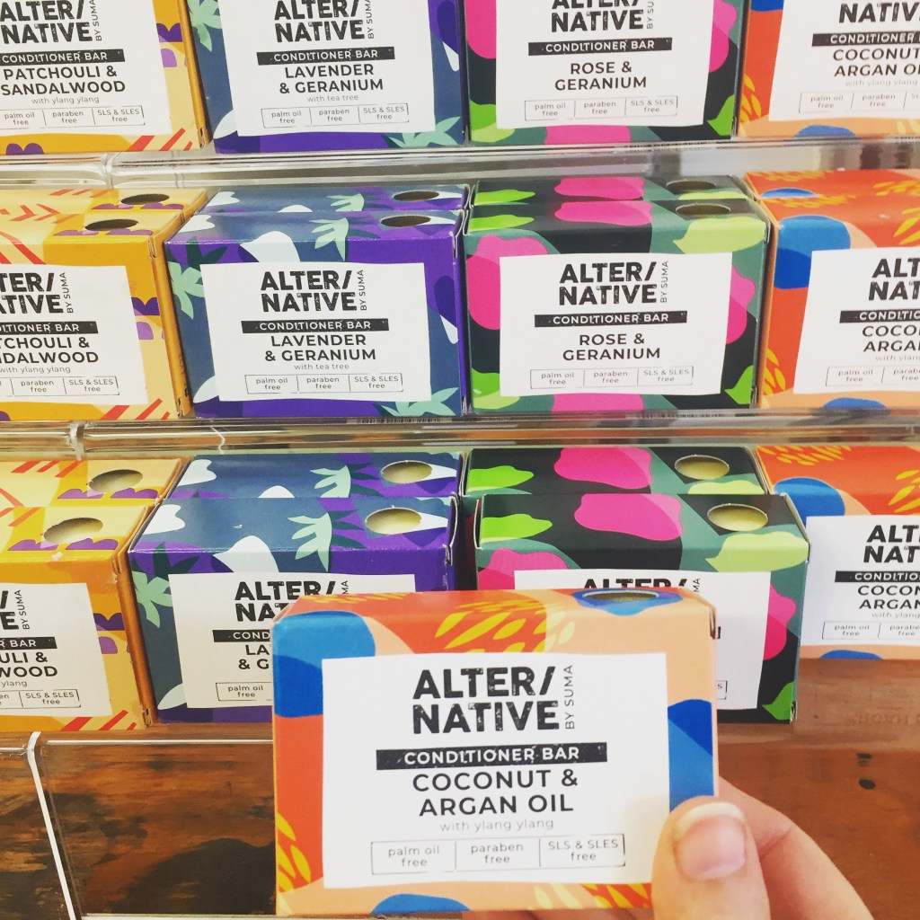
It was ok at the time (2018). But there’s only so much kraft paper brown and clean, natural earth colours one market can take. Though I understand deviation from that theme may harm your ‘eco friendly’ appearance – some brands have made the change by incorporating organic shapes (Suma, alternative soaps) or using bright, but subtly subdued colours or retro styles
The Alter/native (see what they did there) packaging – abstract but leafy
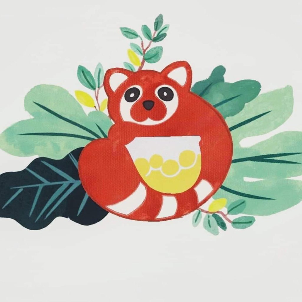
I’ve started with a name change (Panda Refills), added some leaves and a mascot. I keep the ‘slightly hand drawn’ look – this is a small business and not polished. The original Jartree logo was supposed to look like a vintage simple stamped logo (shop old fashioned, traditional)
I’ve been playing with a few different looks from watercolour children’s book illustrations to soften and brighten this – but I abandoned them mostly for harder block colour. I like the round Jartree logo though, so the panda will remain rounded in spirit.
Early logo draft – watercolour style with texture
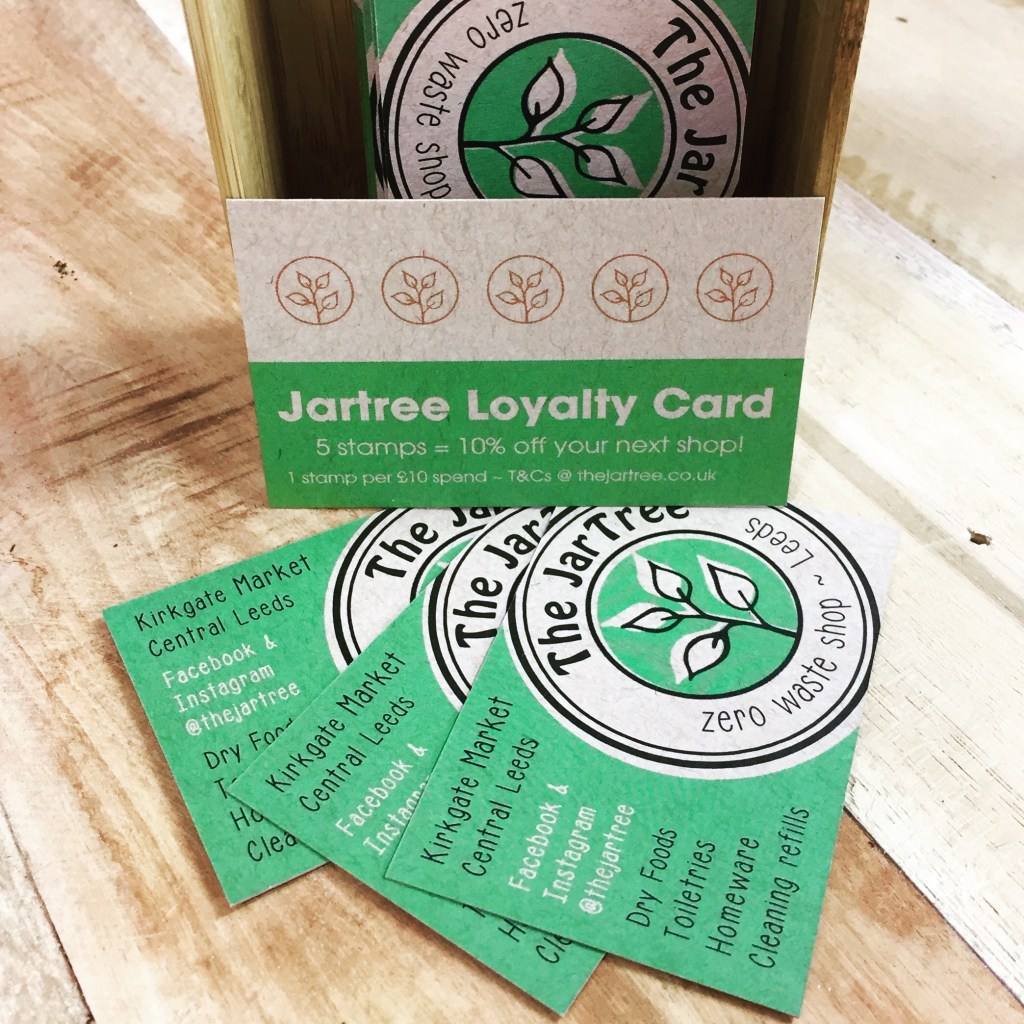
The loyalty cards remain the dreaded kraft paper – but small steps. The font is now a variant of Futura and the logo is sharper, with clean lines that transfer into line-only versions
Block colour simple loyalty card designReopening poster art with logo
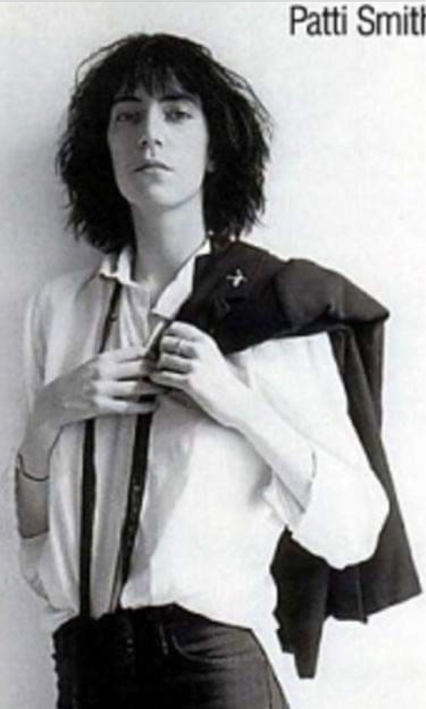
A very quick simplified outline drawing of Patti Smith from the cover of the 1975 Horses album.
Patti Smith simple line drawing outline
Tattoo request – just do the outline and block colour of the hair and shirt (maybe some of the jawline)
I listened to the album once I finished drawing – it was listed in Rolling Stone‘s “500 Greatest Albums of All Time” (a respectable #44) – I didn’t like it, but I don’t know anything about music and my taste is awful.
Working on large format printed boards to signpost people to products/reductions/instructions etc. And you need a surprising amount of them
I was experimenting with simple illustrations to add a bit of playfulness online and in the store
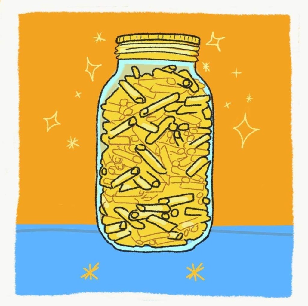
Beautiful penne
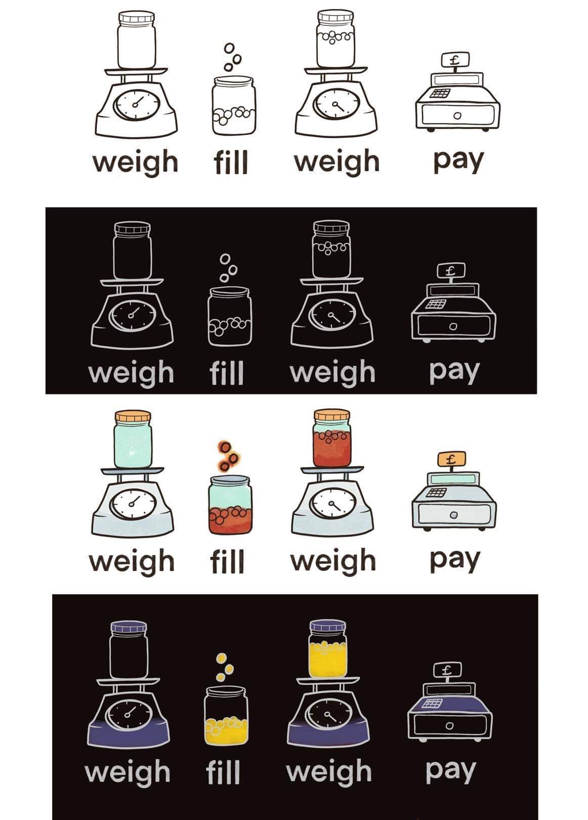
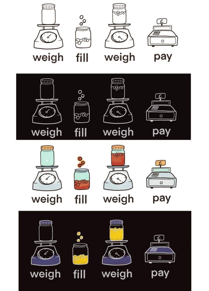
The below images of scales and jars illustrate how to buy refill food when bringing your own containers – the scales and register are completely inaccurate, I’m using recognisable old-fashioned images rather than realistic.
The pasta above is very accurate – that’s exactly what penne looks like
Illustration for refill foods
The above were made before I decided not to go with my own illustrations and instead use simpler, ready made line and shape icons for a more solid, uniformed look – they’re quick(ish) to change, design etc.
I designed them with a mix of Futura and hand written type fonts to give a little vintage advertisement feel – all the icons use are free from a popular icon website (or a small fee for a commercial licence) I’ll remember the name later
I overlayed some of the icons on the larger ceiling signs – a white icon over a black one to give a little bit of movement – it made them a little bit more interesting
Creating space / playing with a flat illustration – learning digital drawing in lockdown
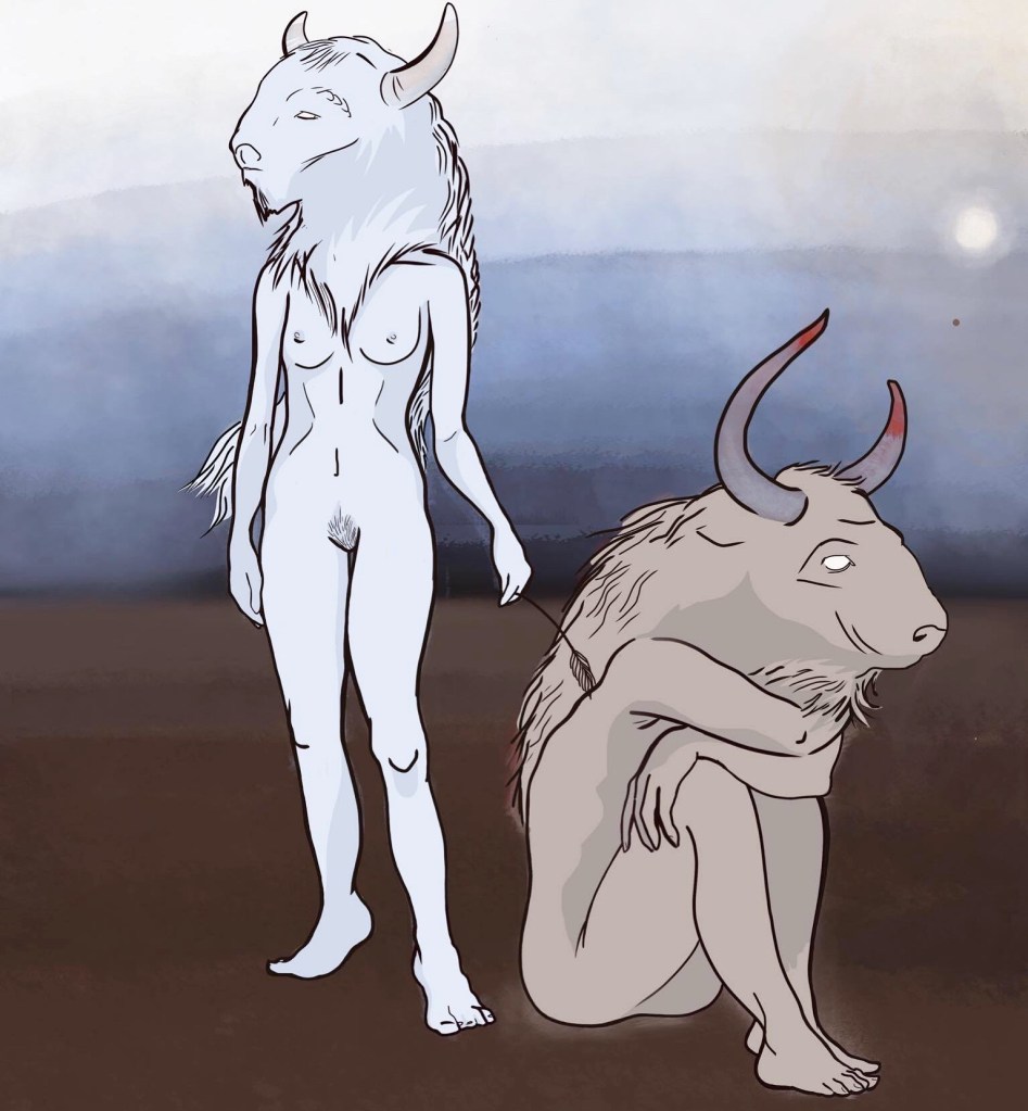
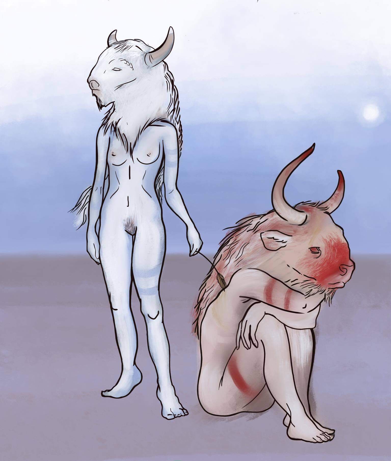
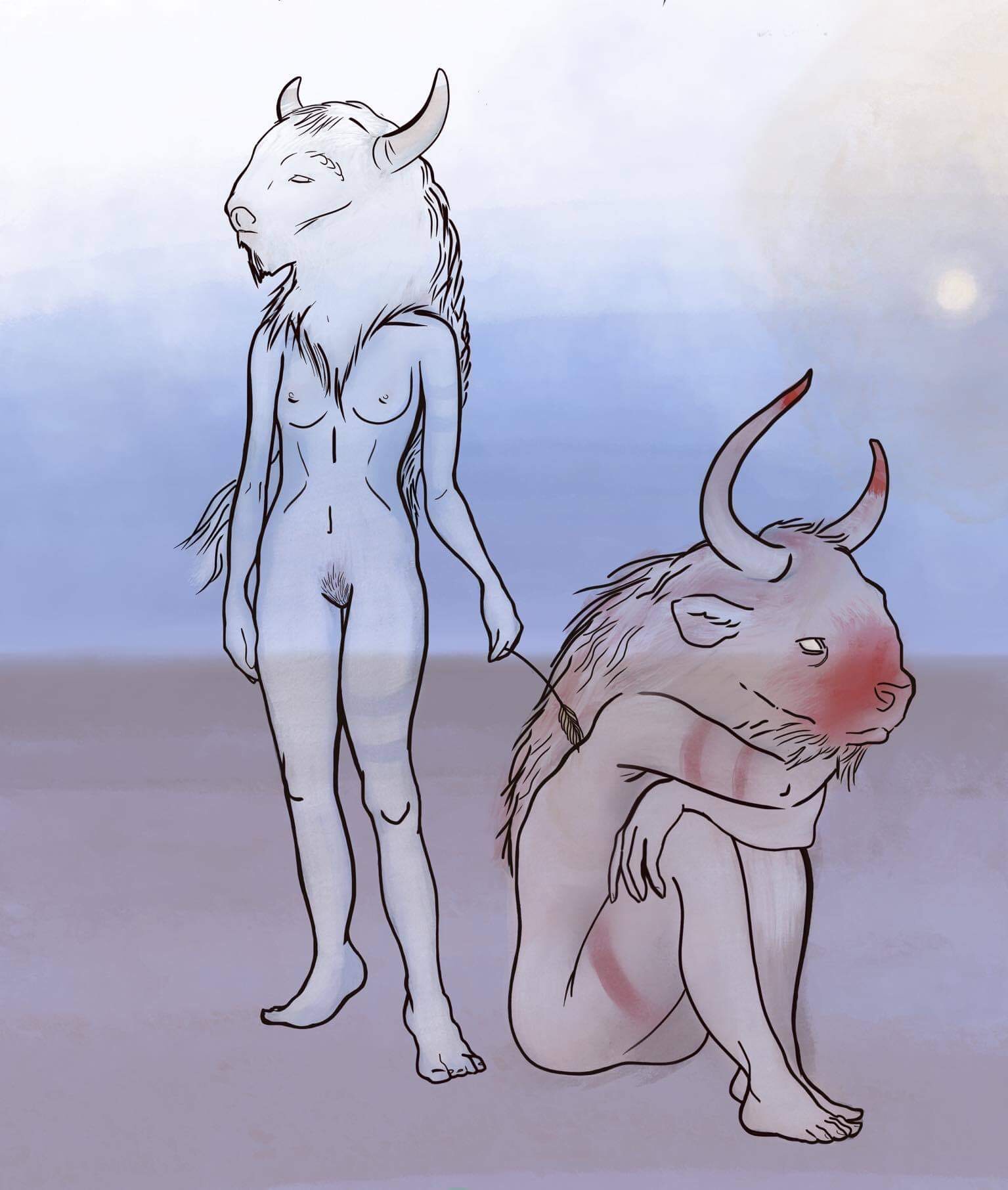
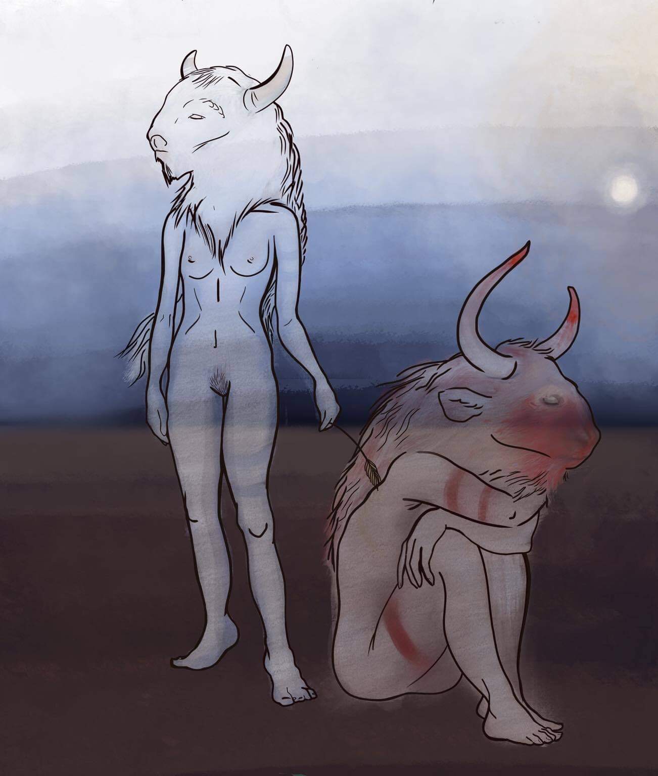
Listless minotaurs – this is a quick digital drawing of some pensive minotaurs. I was trying to create a sense of cold distance between them using the colours/ background, with varying degrees of success
I don’t know what else I can say about this, I’ve been photoshopping animals together for fun and relaxation purposes.
I spent an amount of time (unspecified amount of time ago) looking through old D&D Monster Manuals, then making stat cards for my own monsters – which I would design, and were mostly dragons.
It’s fun. And lately, with lockdown, I’ve had time to do some more.
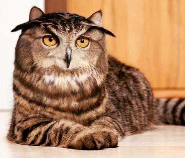
I like to scour the Internet looking for pictures that would suit each other (in either shape, subject or tone) to make my digital collages. It’s relaxing and infuriating
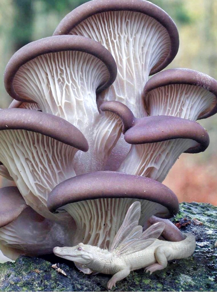
This is 100% real, I took this picture
I like to think about the little world in which these animals were a possibility- I know crocodiles aren’t aerodynamic, but neither are bees to be fair.
I’m currently working on a kind of Badger-Horse, do watch out for that
The photos are mine, unless specified, or clearly not mine, because they’re from 1979
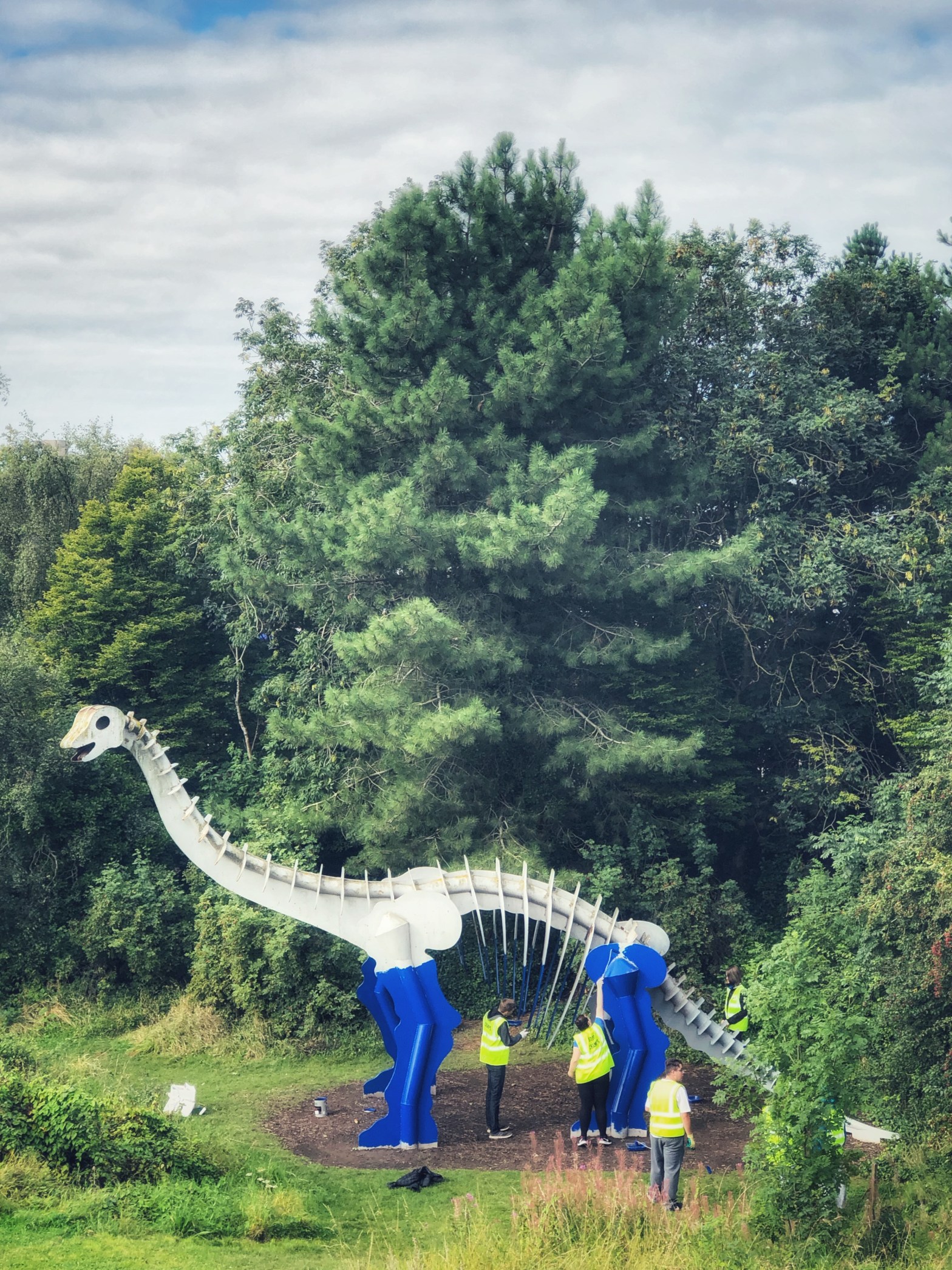
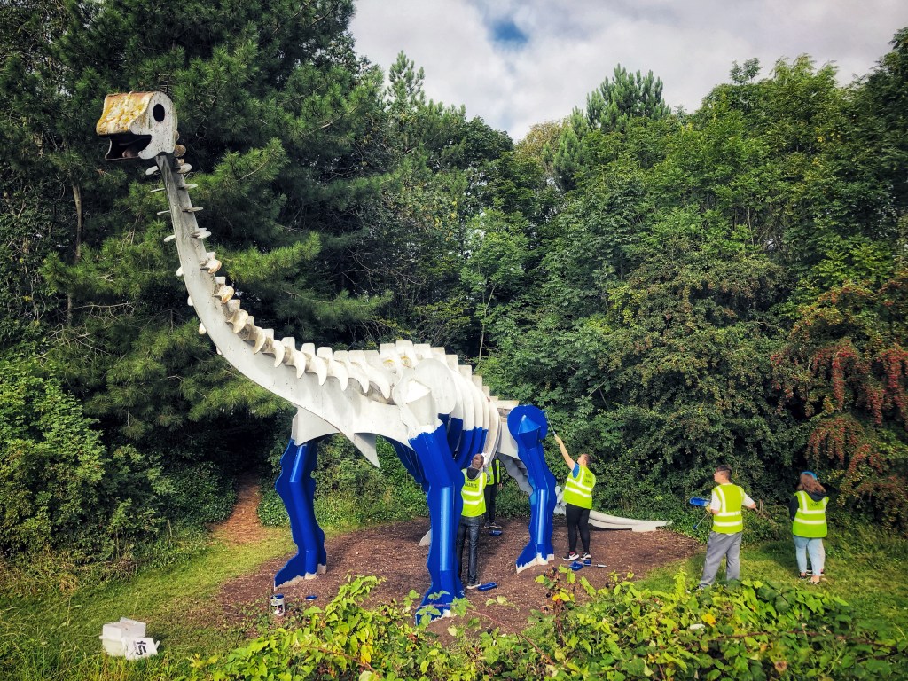
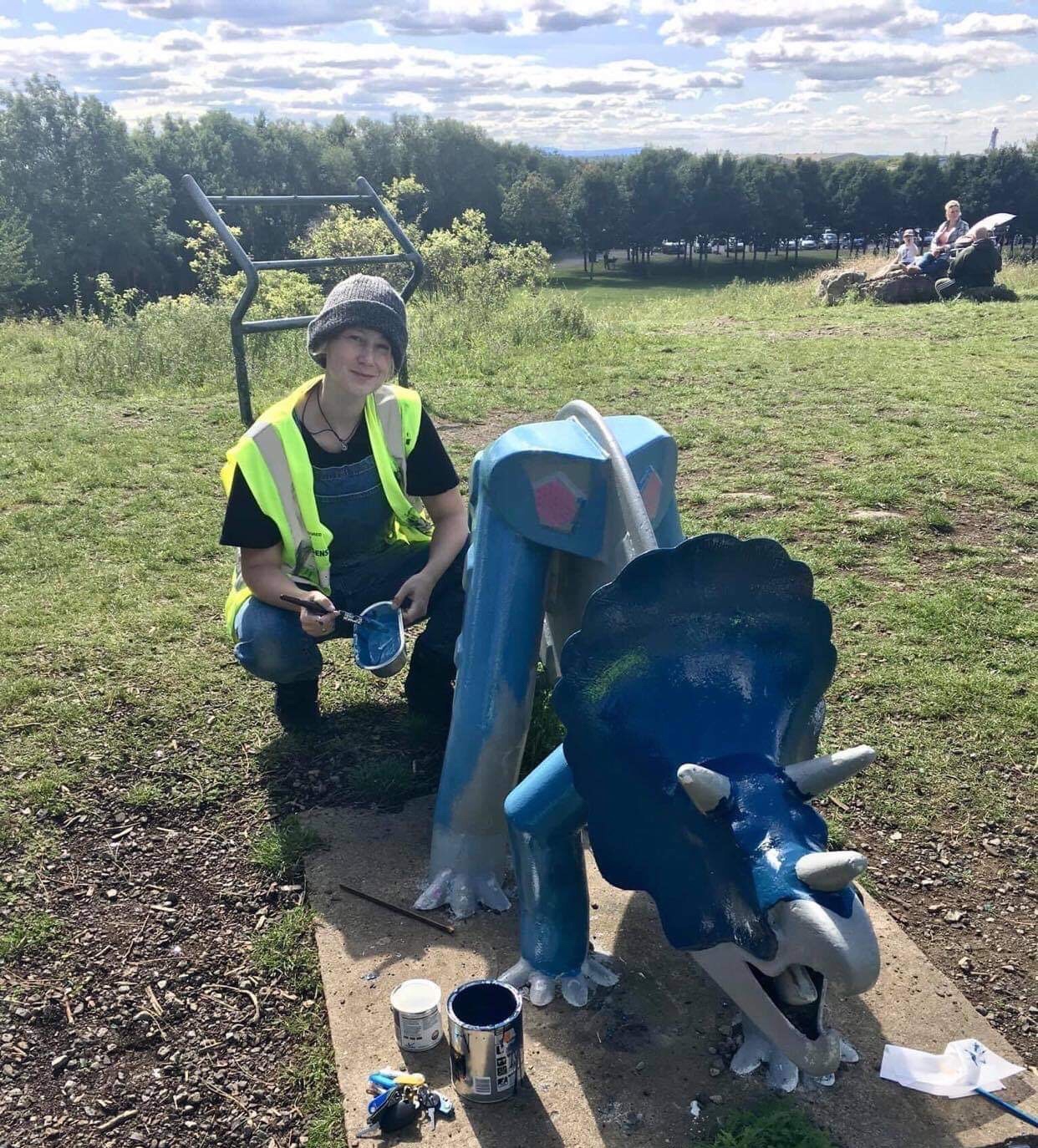
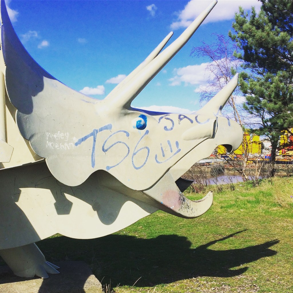
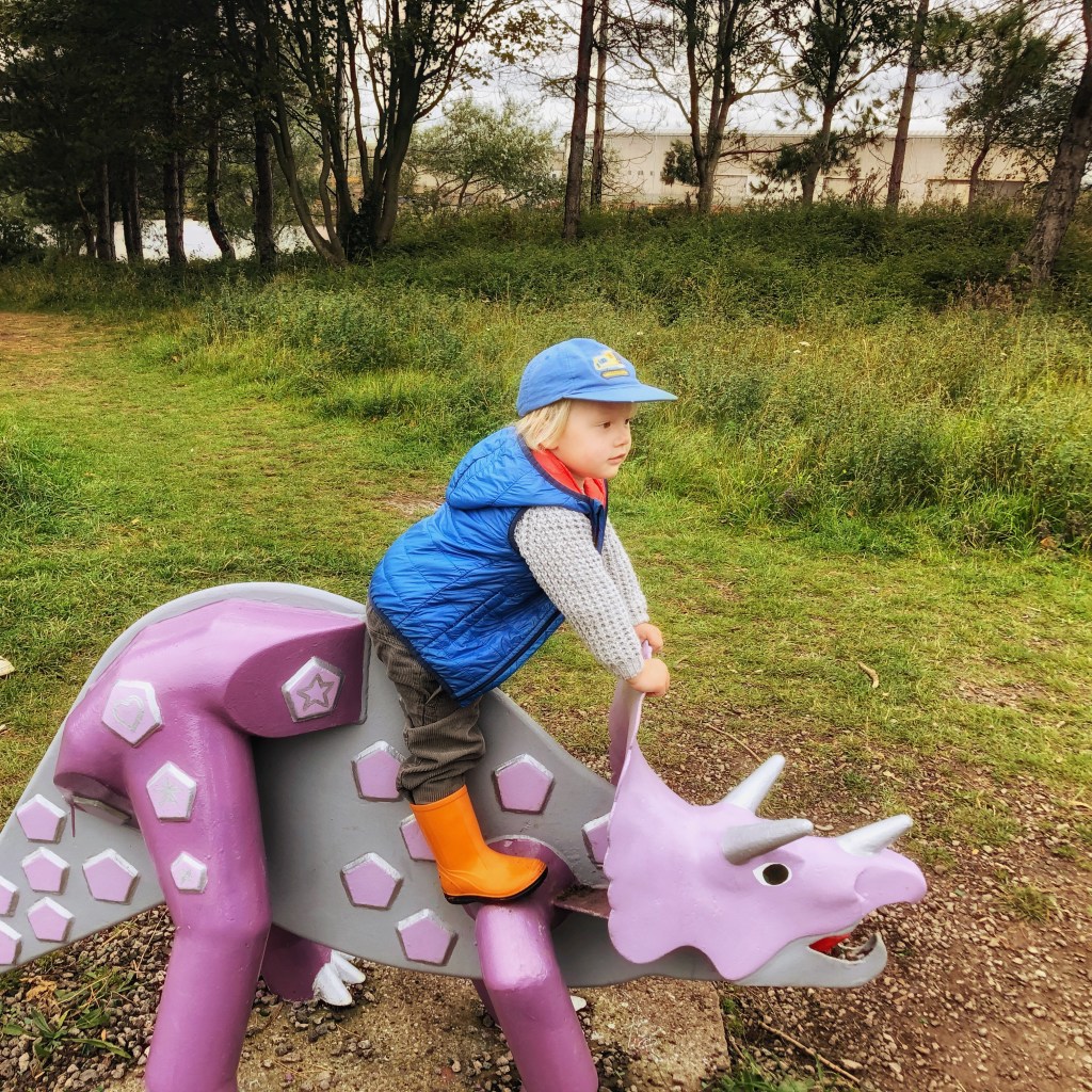
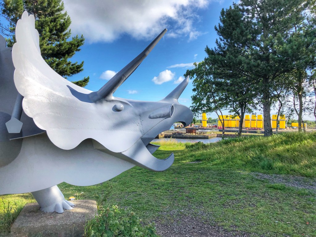
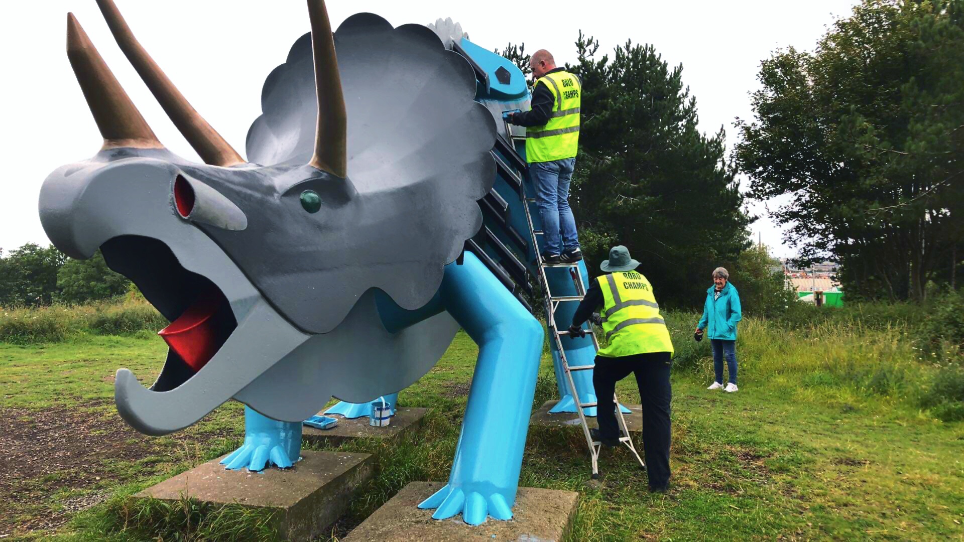
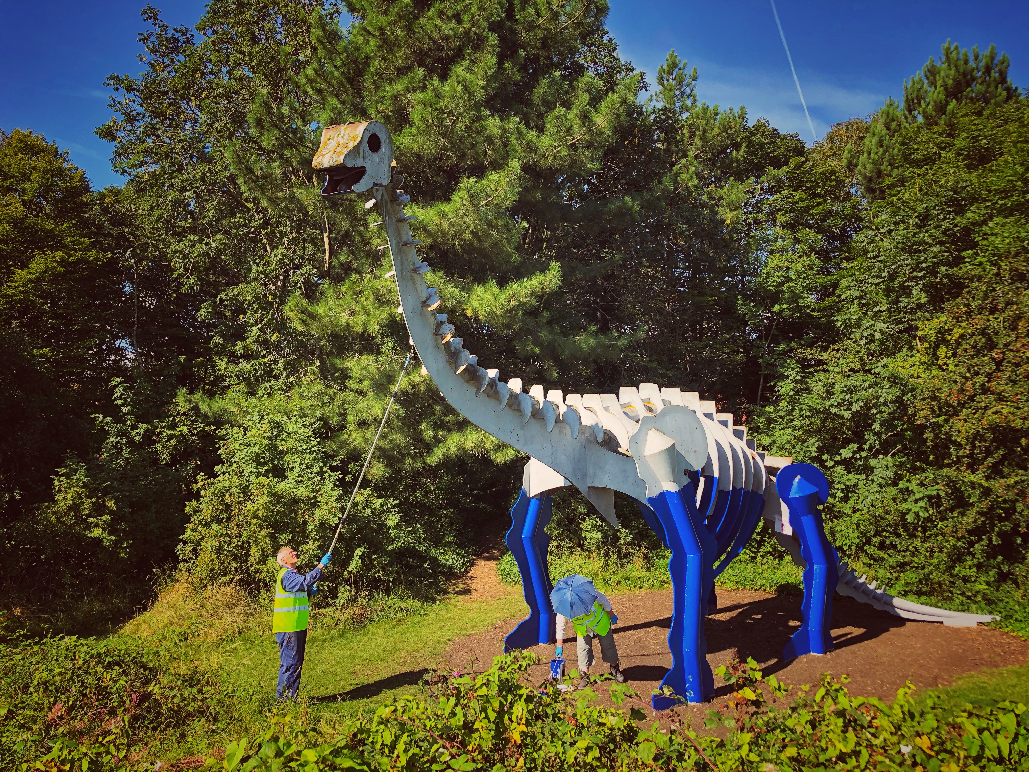
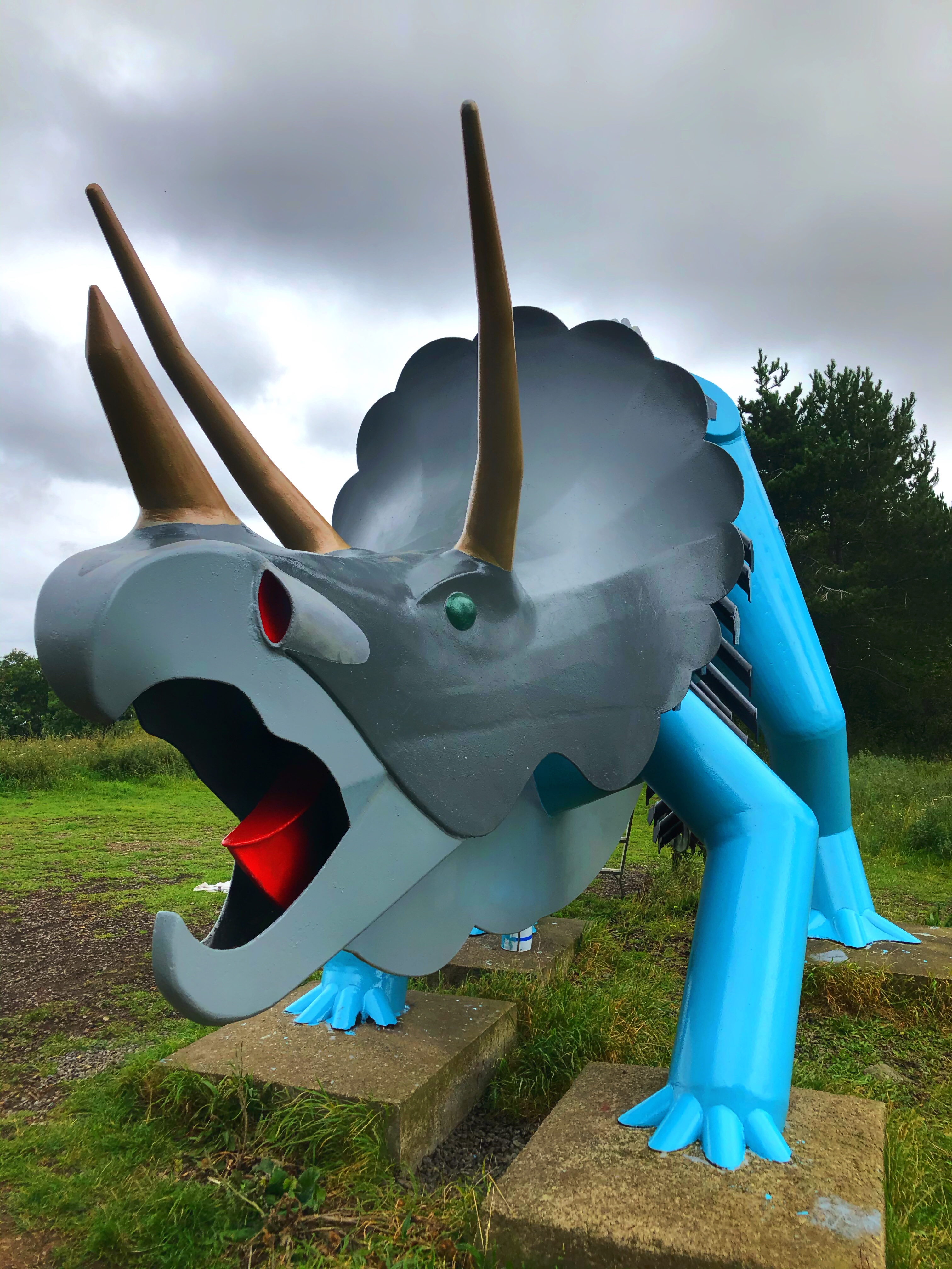
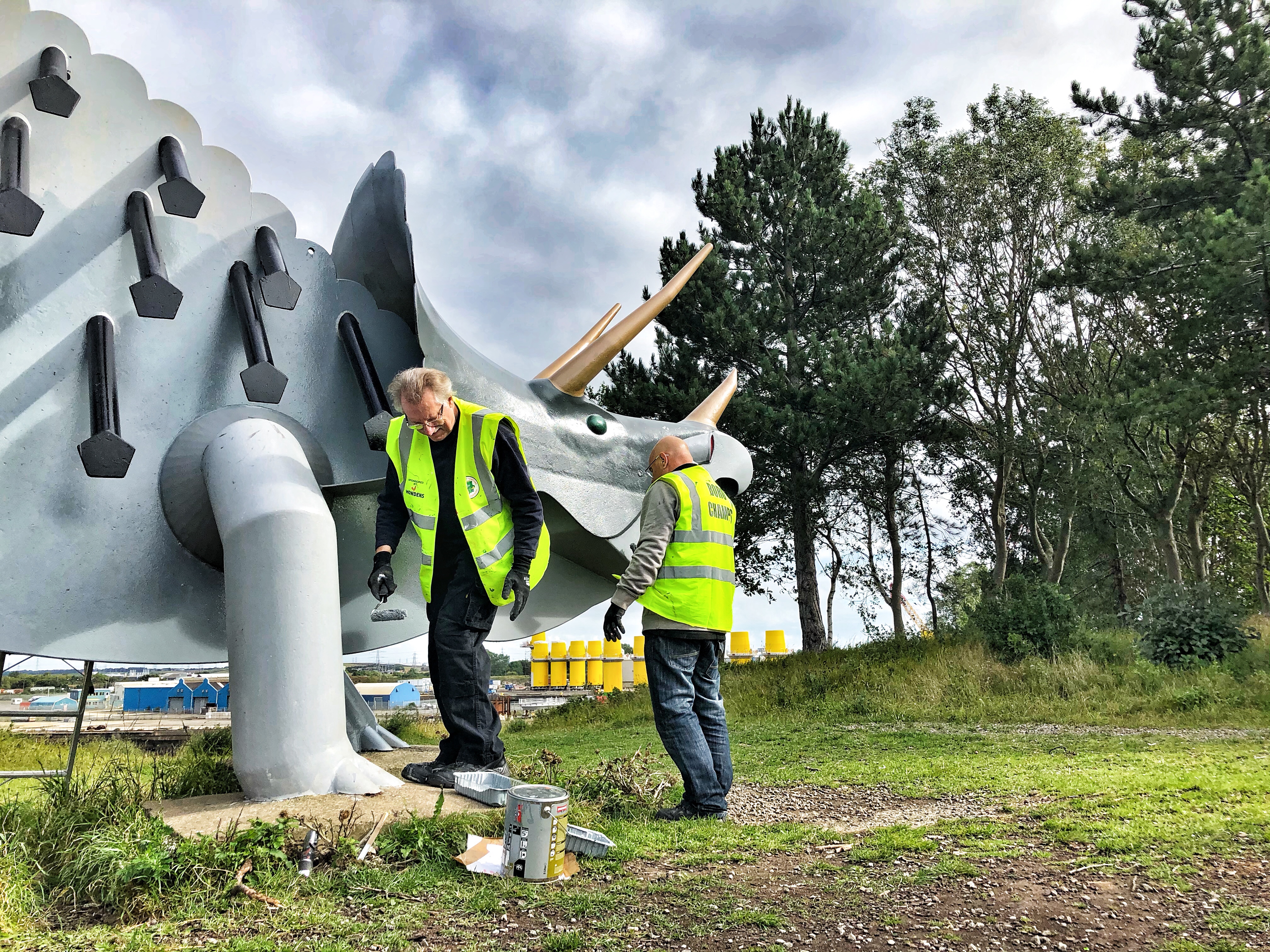
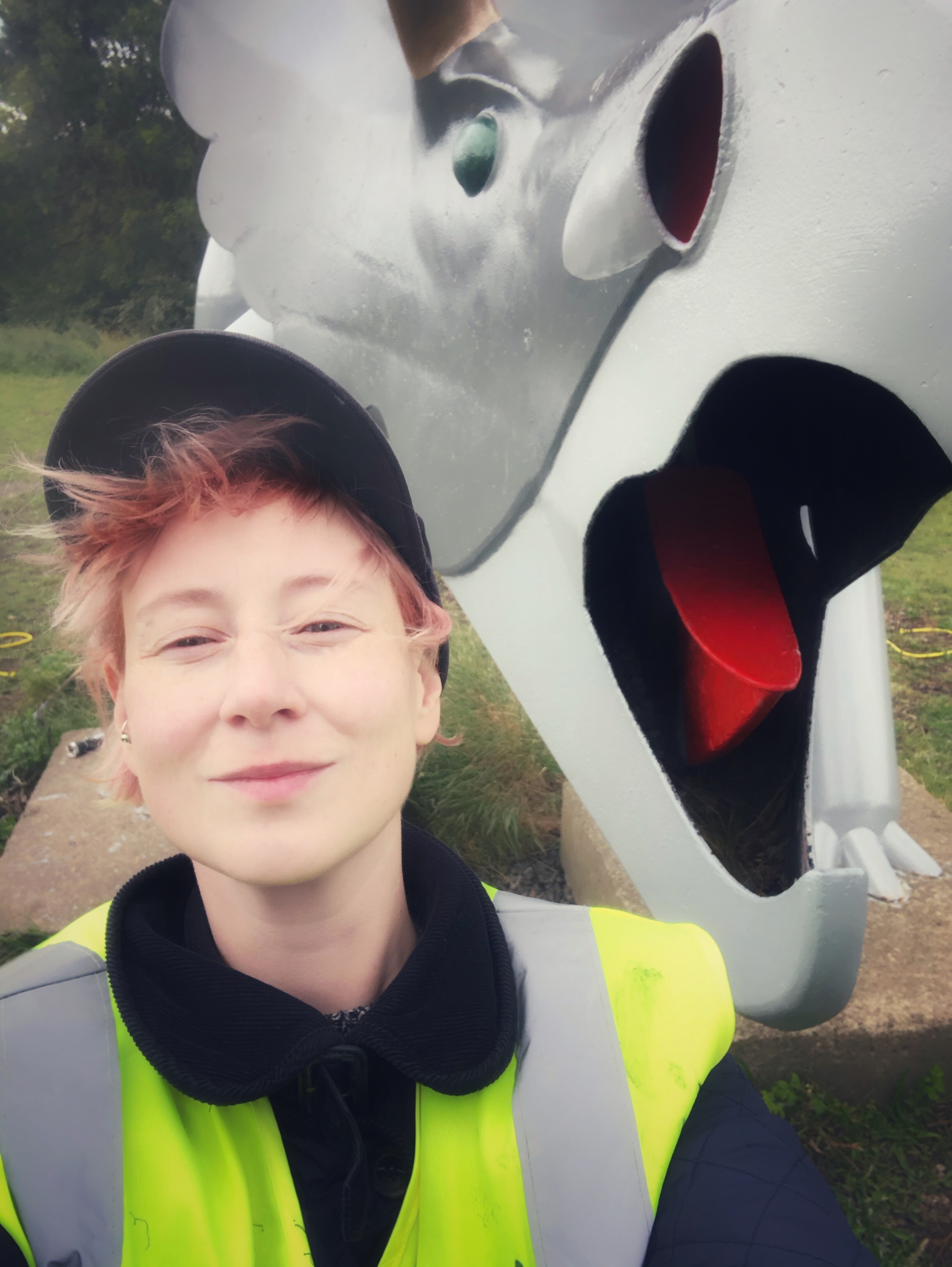
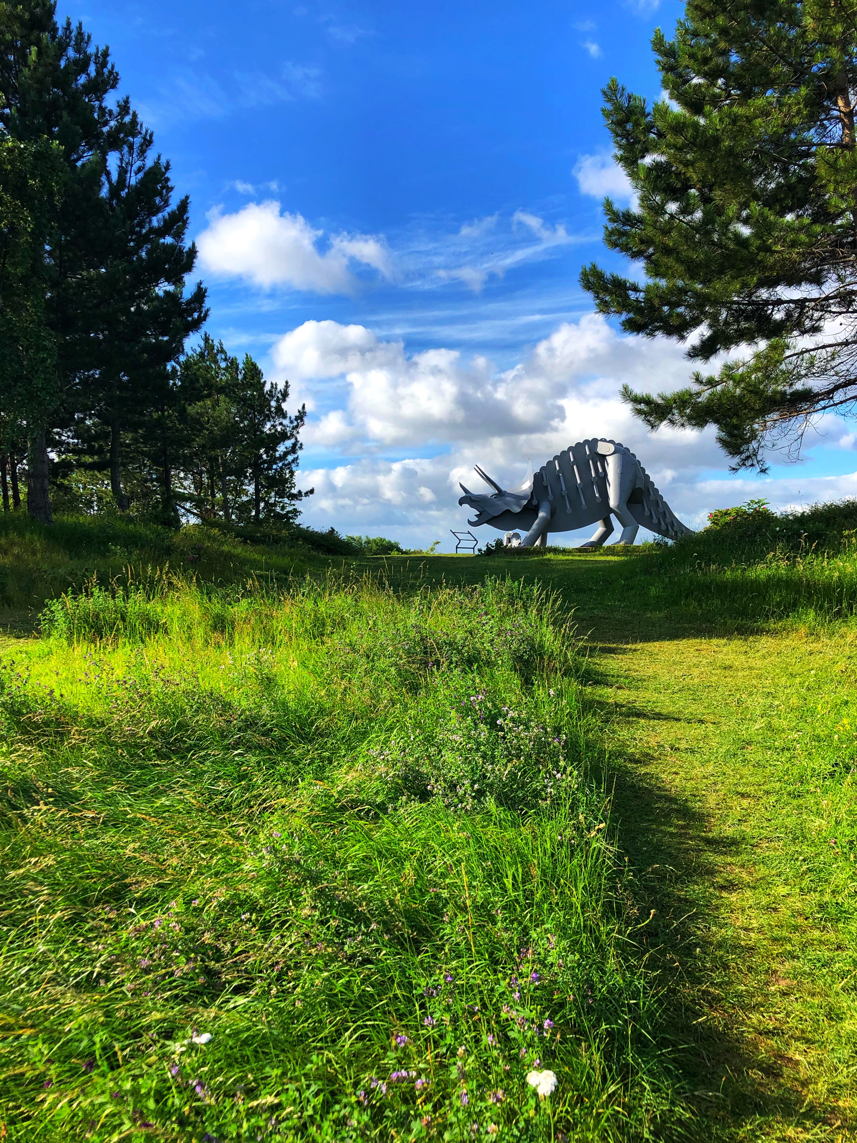
I did help out with some painting, because the dinosaurs are near my studio. I even got to paint a small triceratops, which has long been a dream of mine
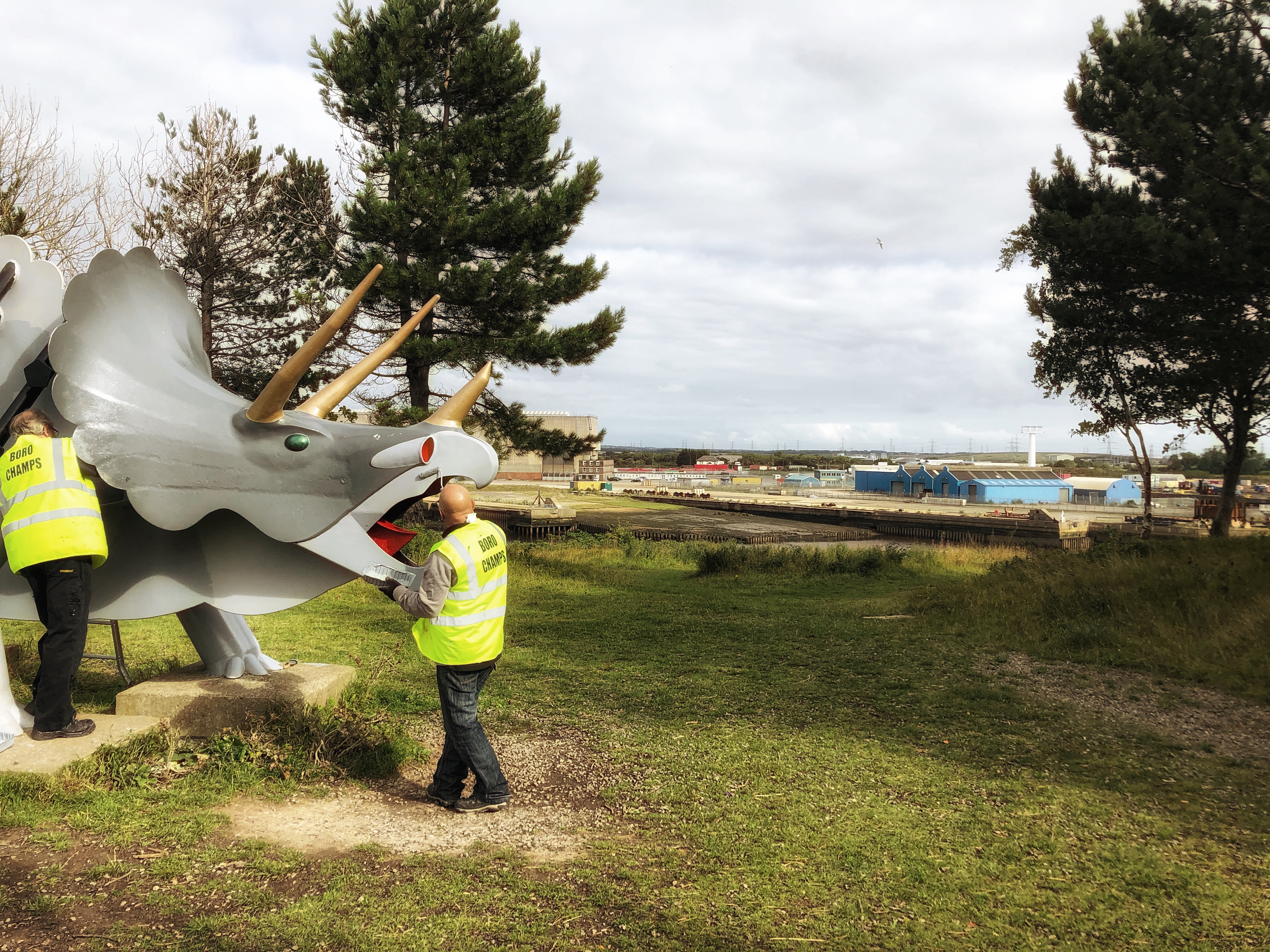
This project (undertaken during lockdown) was to rejuvenate the Tees Dinosaur Park, on the riverside by cleaning and painting the dinosaurs (which we’re looking tatty and graffitied) – with the aim of making it a bit more family-friendly and attractive to visitors
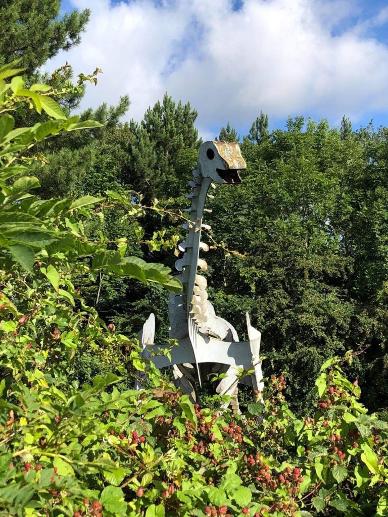
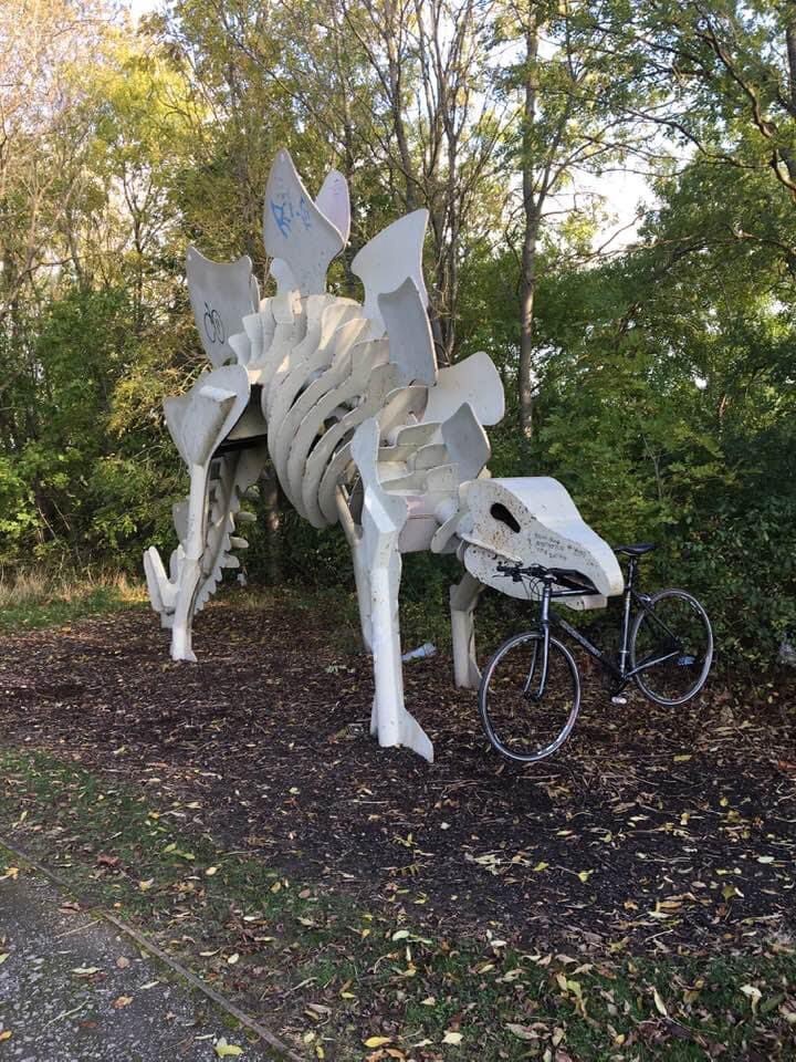
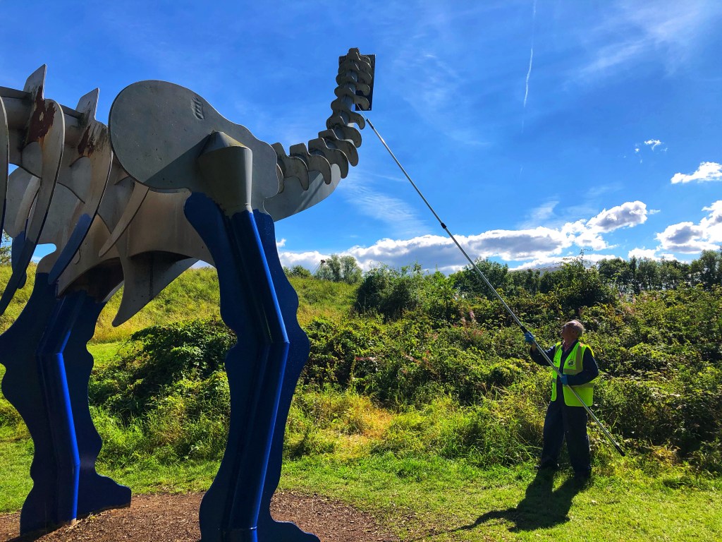
Always watching – Dippy the giant steel dinosaur looks over the River TeesDennis the TriceratopsFlorence eating a bike (Photo by Community Volunteers Middlesbrough )
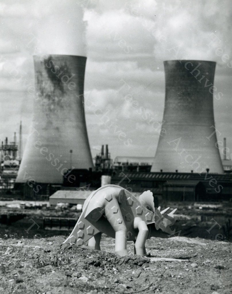
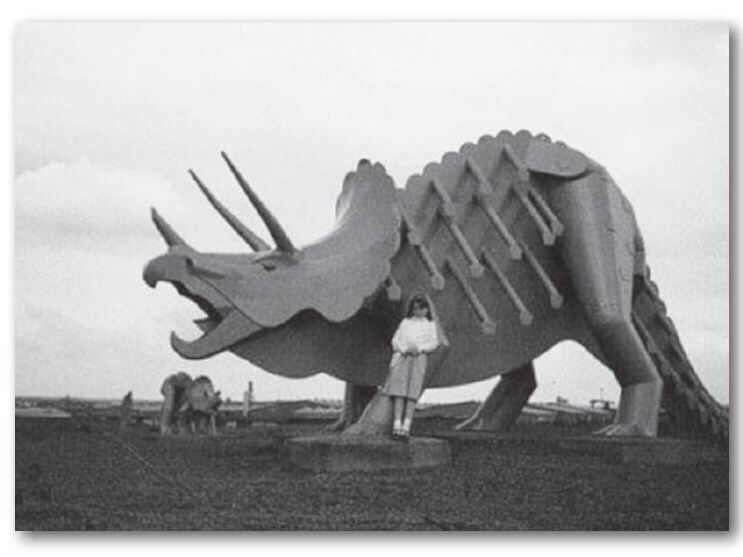
The dinosaur sculptures were erected in the late seventies ~ early eighties. In the (once) Heart of Teesside’s ironmasters district – as a Tribute to the local steel/iron construction industry – metal sculpture park makes sense. Not sure why they’re dinosaurs though, that doesn’t make sense. Probably because they’re cool af .
Baby triceratops – (Photo from the Teesside Archives) (Photo by Community Volunteers Middlesbrough )
Some scale for this, the dinosaurs are life sized and volunteers weren’t allowed to use ladders (health and safety) so Dippy took the volunteers quite a while with roller sticks
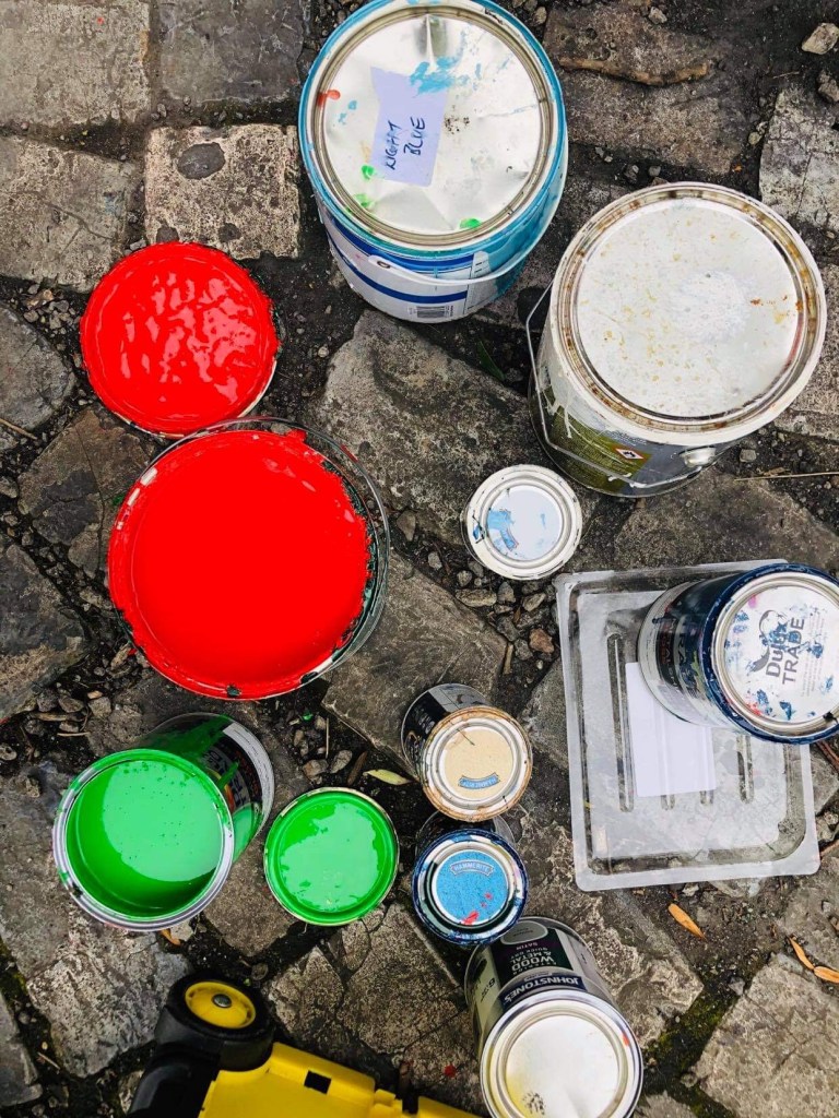
The paint used was donated by local decorating businesses – so the dinosaurs were painted with whatever colours were on hand. The triceratops and babies were painted last by Jaqui and I – They were the only ones with custom mixed colours to make them more exciting for the kids to play on.
The dinosaurs were unofficially named by the volunteers, including Dippy, Florence the stegosaurus, And Dennis (named by the volunteer Dennis, who repeatedly suggested the name ‘Dennis’ for all the dinosaurs)
The project was an outstanding success, for which the community volunteers won a Civic Community award (2020) for making physical improvements to the neighbourhood and increased the popularity of the park with local people and visitors – afterwards the council added block seating to the park to accommodate families having picnics here